Bodner, R. C., & MacKenzie, I. S. (1997). Using animated icons to present complex tasks. Proceedings of CASCON '97, pp. 281-291. Toronto: IBM Canada Ltd.
Using Animated Icons to Present Complex Tasks
Richard C. Bodner1 and I. Scott MacKenzie2
1 Department of Mechanical & Industrial EngineeringUniversity of Toronto
Toronto, Ontario, Canada M5S 1A2
2 Department of Computing & Information Science
University of Guelph
Guelph, Ontario, Canada N1G 2W1
Abstract
An experiment was conducted to compare the recognition accuracy for static and animated buttons. Static and animated buttons were designed for 28 computer tasks. The tasks were categorized into low, medium, and high levels of complexity. Subjects identified the correct tasks of the animated buttons (78.6%) more often than for the static buttons (64.3%). The data were also analyzed for the number of correct responses for each task. Recognition accuracy were higher for the animated buttons (79.1%) than for the static buttons (69.7%). Further analyses indicate that animated buttons are particularly useful for representing high complexity tasks to the user. Of the nine high complexity tasks, six were found to have a higher animated mean than static mean, and a significant difference between the recognition rates for the animated and static versions of the task.
Introduction
Software systems today are increasingly complex. Traditionally, functionality is added to a system via menus; however, as the number of functions increases so too does the number of menu levels that a user must traverse. To facilitate complexity, designers conceive of new ways to add functionality. Many techniques are used, such as hierarchical menus, wizards, cue cards, toolbars, and modes. Many of these are themselves complex. A toolbar is a shortcut to functions found in menus; however, the functions are usually displayed as icons (a button can be thought of as an icon) which are often abstract. There are many issues in implementing toolbars; for example, whether the toolbar should be stationary or free floating; the number of different toolbars; or the modality of the toolbar [8]. Although a toolbar is intended to reduce the complexity of a software system, it inherits its own complexity. This is evident not only in the number of questions associated with using a toolbar, but also because today’s toolbars include pop-up help (e.g., Microsoft’s Word and Lotus’s Lotus Approach). Pop-up help is claimed to reduce the complexity of the toolbar by helping the user understand the functions available. It is a useful aid to understanding most of the functions offered on the toolbar; however, some explanations are very sparse (e.g., see Figure 1), leaving the user in the same position as before viewing the pop-up help.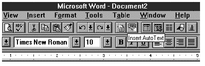
Figure 1: Typical pop-up help message in Microsoft Word.
|
Low Complexity |
Medium Complexity |
High Complexity |
|
Left justify text |
Send an email message |
Change the page orientation |
|
Right justify text |
Read an email message |
Erase |
|
Bold text |
Select font pointsize |
Negative of object |
|
Italicize text |
View animation clip |
Rotate object |
|
Save document |
Select line width |
Re-size object |
|
Open document |
Select line pattern |
Select document view ratio |
|
Flip horizontal |
Insert object |
Select text border |
|
Flip vertical |
Listen to a sound clip |
Select number of columns |
|
Draw a line |
Compress diskette |
Select table size |
|
|
Set the volume level |
|
Baecker et al. (1991) identify ten basic questions that animation can answer about a system or interface. Three of the ten stand out as important to the design of buttons or toolbars. They are identification ("What is this?"), demonstration ("What can I do with this?"), and explanation ("How do I do this?"). Although an animation could potentially answer all ten basic questions noted by Baecker et al. to some degree, it is unlikely that it could address all ten at once. It is more realistic to target an animation to answer one or, at most, two questions. The variance in the types of questions is too great and if an animation attempted to answer too many questions, it may become too complex. Overly complex animations may confuse instead of enlighten the user.
1.1. Design Issues
The first design issue for our experiment was the choice of functions to be included. Since the experiment was intended for a range of computer users, the set of functions had to be challenging for all. Functions, or tasks, ranging from the cognitively simple (e.g., bolding text) to the cognitively complex (e.g., re-sizing an object) were included in the experiment. Figure 2 lists 28 computer tasks which were included. The tasks were placed within one of three groups: simple, medium, and high complexity. To determine the placement of a task within a group, we sought the opinion of a panel of three expert users. After the tasks were chosen, we designed a representation of each using both static and animated buttons. This was difficult, since the design of the button image can affect factors such as learning time, retention, and relearn time [6]. Although the design is important, there is scant literature on the subject. The design of icons draws on many fields of research, such as, computer graphics, cognitive and perceptual psychology, education and learning, and linguistics and semantics [4]. Certain guidelines were followed, such as avoiding highly detailed, stylized, optical illusions or culturally biased images [5]. We strived for simplicity in the shapes used to form the icon and avoided overlapping images as much as possible. Solid symbols were used when appropriate to denote important elements within the icon. We also attempted to address only one of the three questions mentioned previously. Although a professional graphic designer was not used, our expert panel reviewed the icons for their "goodness" to the given task. In addition, a pilot study of 12 subjects was run, and the results and comments from the study were used to eliminate potentially bad icon designs and to modify others. Once the animated sequences were designed, the problem emerged of how to choose the static image for the same function. One possibility was to choose one frame of the animated sequence that best represented the function. This was done for some of the static buttons; mainly for the cognitively simple tasks. In addition, some of the static icons were in part or entirely based on static icons found in many applications (e.g., the bold and italic icons are similar to the ones found in Microsoft’s Word ). For the complex tasks the use of a single frame was not appropriate since no one frame gave the user enough information to accurately identify the function. For these tasks a new static image was designed to represent the function. Both the static and animated buttons were placed on a button 115 × 47 pixels in size. The largest icon was 95 × 28 pixels. The smallest was 12 × 12 pixels. Although a typical button is approximately 24 × 24 pixels, we used a larger size to assist the subjects in viewing the images (animated and static).2 Method
2.1 Subjects
A total of 102 subjects (36 male, 66 female), primarily university students, participated in the study. The subjects were given a questionnaire which asked about their computer experience (including familiarity with graphical user interfaces, word processors, etc., and amount of time per week using a computer). From the results of the questionnaire each subject was placed in one of three categories of computer users: novice, intermediate, and expert. The majority of subjects were novice (50), and intermediate (45) computer users. Seven subjects identified themselves as expert computer users.2.2 Apparatus
The software was developed using Asymetrix’s Toolbook (version 1.53) running under Microsoft’s Windows (version 3.1). The software ran on a 50 MHz 486DX with a regular VGA monitor and mouse.2.3 Procedure
For each of the 28 computer tasks, both animated and static buttons were designed, as described earlier. Figure 3 shows the static buttons and Figure 4 shows animated sequences, for all 28 tasks. For the animated buttons only four frames are shown for each animated sequence; however, some required more to smooth the animation. The extra frames are excluded in Figure 4 since they do not add additional information in print. The 56 buttons were separated into two sets. Dividing the buttons ensured that a subject was not exposed to the static and animated button of the same task. Both sets included 14 animated and 14 static buttons. The subjects were asked to identify the function of the button presented to them. Figure 5 shows a sample screen. Five plausible explanations were given. Although no formal guidelines were followed in generating the explanations, our panel judged the plausibility of the explanations. For animated buttons, the animation ran continuously, pausing briefly at the end of the sequence so the subject could tell when the animation began and finished. Although having a continuous animation running can be distracting in a real application, it was used here to allowed subjects to concentrate solely on the task of identifying the correct function of the button. All subjects were given instructions and were shown examples of static and animated buttons before starting the experiment. A typical session lasted between 10 and 20 minutes depending upon the subject’s pacing. After completing the experiment, subjects were given a questionnaire in which they could express their opinion of static and animated buttons.
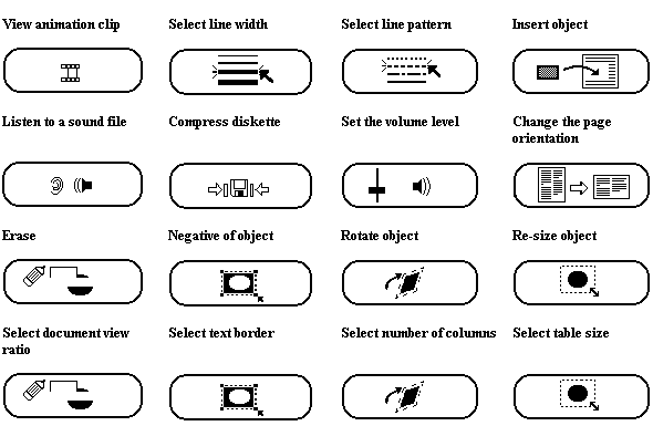
Figure 3: Static images for the computer tasks
3 Results and Discussion
There was a significant difference in the recognition for animated vs. static icons (F1,101 = 32.0, p < .0001). Subjects were able to, on average, correctly identify the function of 11.1 out of the 14 (78.6%) animated buttons shown. Subjects were only able to identify correctly 9.7 out of the 14 (64.3%) static buttons. Subject responses varied more for the static buttons (SD = 2.22) than for the animated buttons (SD = 2.02). When decomposed by user group the results were similar to the overall results. Novice users were able to identify 10.6 out of 14 animated icons (SD = 2.1) and 9.0 out of 14 static icons (SD = 2.3). Intermediate users were able to identify 11.5 of the 14 animated icons (SD = 1.8) and 10.3 of the 14 static (SD = 1.9). Expert users had the smallest difference between the animated and static recognition accuracy: 12.3 out of 14 (SD = 1.6) and 11.1 out of 14 (SD = 1.8) for animated and static buttons respectively. Novice users had the lowest recognition accuracy for both animated and static buttons and also had the largest difference. These results reveal a slight increase in recognition accuracy with users' computer experience.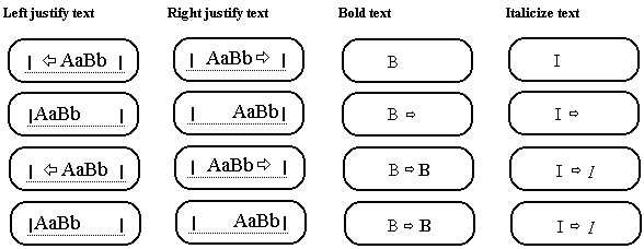
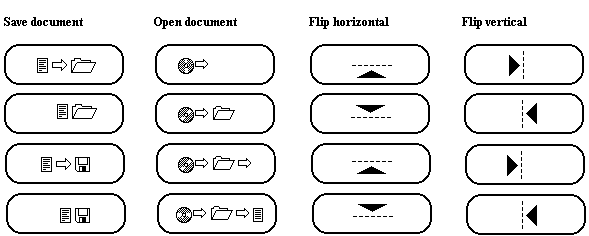
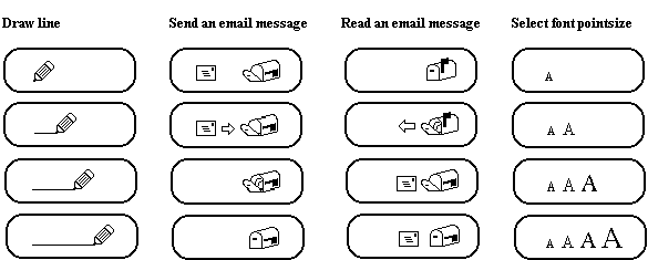
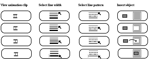
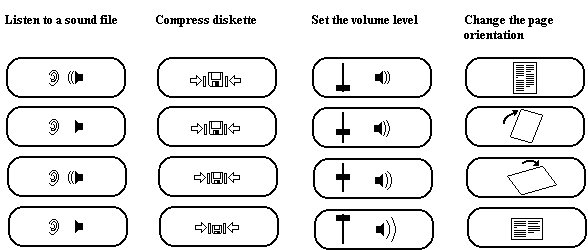
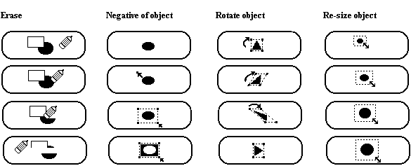
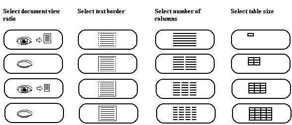
Figure 4: Animation Sequences for the computer tasks.
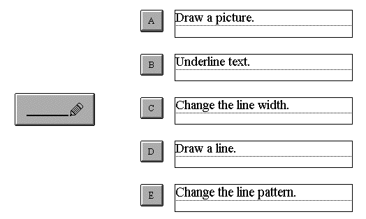
Figure 5: Sample screen presented to subjects
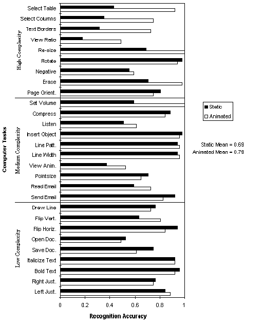
Figure 6: Subject recognition accuracy per computer task
A more revealing analysis compares the recognition accuracy on a per task basis, since some are inherently easier to identify than others. The results are given in Figure 6. The mean for the animated versions of the tasks (79.1%) was greater than the mean for the static versions (69.7%). Seven of the tasks yielded a significant difference in the recognition accuracy between the static and animated versions (see Figure 7).
| Set the volume level | F1,101 = 35.0, p < .0001 |
| Erase | F1,101 = 16.6, p < .0001 |
| Re-size object | F1,101 = 22.9, p < .0001 |
| Select document view ratio | F1,101 = 12.5, p < .0006 |
| Select text border | F1,101 = 20.5, p < .0001 |
| Select number of columns | F1,101 = 18.4, p < .0001 |
| Select table size | F1,101 = 37.8, p < .0001 |
The higher mean and lower variance in animated recognition accuracy suggests that animation can assist many users to identify the correct function of an icon. The lower mean and higher variance of static buttons can be attributed to the subjects’ level of computer experience. Subjects that are novice to intermediate computer users may not be able to accurately identify the function of a static icon due to their limited computer experience. When an icon is animated, computer experience is not such an influence on the recognition accuracy since the animation may compensate for the user’s lack of computer experience. It helps in answering basic questions that a less experienced computer user may ask, as opposed to expert users who can draw upon their prior knowledge to help answer the questions.
Of the seven icons with significant differences in recognition accuracy, six were categorized as high cognitive complexity. Out the high complexity category only two tasks (Rotate Object and Change Page Orientation) had a higher static mean than an animated mean. The difference in means for Rotate Object was only 4% and the difference for Change Page Orientation was 6%. For the tasks with a higher animated mean the difference was much greater (e.g., Re-sizing an Object, 31%; Selecting Table Size, 49%; and Selecting Text Borders, 41%). When the static version for any task had a higher mean, the difference ranged between 2% and 14%. On the other hand, when the animated mean was higher the difference ranged between 2% and 49%. This suggests that animated buttons can relay more information than static buttons. If a static image displays too much information, the image becomes complex and crowded. With animation, individual frames can be simplified because they only attempt to present a portion of the total information. The user must view the entire animation to receive the full message (i.e., the intended function of the button). Animations can provide information to the user in a clear and unambiguous manner.3.1 Subject Preferences
From the questionnaire, 48 subjects explicitly stated that they preferred animated icons over static icons, while 17 explicitly stated they preferred static icons. Twelve subjects felt that animated icons would be helpful to novice users. Some of these subjects were novice users themselves. One of the most interesting comments was that static icons would be good for simple tasks, such as, bolding text or changing the font size. Seven subjects indicated that animated icons would be useful for more complicated tasks, such as, opening a file or rotating an object. Eleven subjects stated that, in some cases, the function of a button would depend on the current state of the application. They would have preferred to see the animated buttons in a "real" application, such as, a word processor or drawing program. These subjects stated that they lacked the context an application provides and thus could not confidently identify the correct function of some buttons. For example, the icon for drawing a line was confused with underlining text. If the icon had been displayed in the context of a drawing application, a subject may have a better understanding of the function. This testing of the buttons in isolation of an application could possibly have an effect on recognition accuracy. Also, three of the subjects mentioned that pop-up help might increase recognition accuracy. Alpert (1991) describes a drawing application that uses both "self-describing" (i.e., animated) icons and pop-up help messages. Although Alpert did not conduct a formal experiment to test the benefits, one is perhaps warranted.4 Conclusion
As the complexity of modern interfaces increases so too does the cognitive load on the user. One way to reduce this load is through an iconic interface. "By presenting user commands and system information in the form of icons (pictures), we can capitalize on the new capabilities of graphic displays, reduce the learning curve in both time and effort, and facilitate user performance while reducing errors" [6]. Although this statement was made some time ago (1983) it still is true today as graphical displays continue to increase in size, resolution, and speed. The present study has shown that animated icons can be an effective technique for conveying information to the user. Animated icons can obviate the need to access complex help systems, thus allowing the user to accomplish his/her task in less time. If a user is able to quickly do what he/she wants with a software product, the user’s approval rating will likely be high and he/she will continue to use the product. The results of this study favour the use of animation, but not for all tasks. For low complexity tasks, static buttons are an acceptable means for conveying information to the user. It is the job of the interface designer to decide when to use which type of button. This study has shown that some types of tasks, particularly cognitively complex tasks, can benefit from animated icons.Acknowledgments
This research is supported by the University Research Incentive Fund (URIF) of the Province of Ontario and the Natural Sciences and Engineering Research Council (NSERC) of Canada. We gratefully acknowledge this support without which this research would not have been possible. About the AuthorsRichard Bodner is a Ph.D. candidate at the University of Toronto in the department of Mechanical and Industrial Engineering. He is currently researching issues in human computer interaction as it relates to authoring and reading of large hypertext collections. He received a M.Sc. (1995) from the University of Guelph, department of Computer Science. Scott MacKenzie is a computer scientist specializing in human-computer interaction, especially human input to computing systems and human performance measurement and modeling. His education includes a B.Mus (1975) degree from Queen's University, a diploma in Electronics Engineering Technology (1978) from Durham College, and M.Ed. (1989) and Ph.D. degrees (1991) from the University of Toronto. MacKenzie is an Associate Professor in the Department of Computing and Information Science in the University of Guelph, Ontario.
References
[1] S. Alpert. Self-describing animated icons for human-computer interaction: a research note. Behaviour and Information Technology, 10-2, pages 149-152, 1991.
[2] R. Baecker, I. Small, and R. Mander. Bringing icons to life. In Proc. of the CHI’91 Conference on Human Factors in Computing Systems, pages 1-6, New York: ACM, 1991.
[3] R. Baecker and I. Small. Animation at the Interface. In The Art of Human Computer Interface Design. Brenda Laurel, ed. Addison-Wesley Publishing Company, Inc., pages 251-267, 1990.
[4] R. Easterby. The perception of symbols for machine displays. Ergonomics, 13, pages 149-158, 1970.
[5] P. Kolers. Some formal characteristics of pictograms. American Scientist, 57, pages 348-363, 1969.
[6] K. Lodding. Iconic interfacing. IEEE Computer Graphics and Applications, 3, pages 11-20, March/April, 1983.
[7] S. Manes. Pushing picture perfect programs: smash that icon! PC Magazine, page 64, June, 1985.
[8] J. Spool and C. Snyder. Designing for complex products. Tutorial notes from CHI’95 Conference on Human Factors in Computing Systems. 1995.