Asian Heritage Month 2022 |
Asian Heritage Month 2022 |
Asian Heritage Month 2022 |
Asian Heritage Month 2022 |
Asian Heritage Month 2022 |
Asian Heritage Month 2022 |
Asian Heritage Month 2022 |
Asian Heritage Month 2022 |
Asian Heritage Month 2022 |
Asian Heritage Month 2022 |
Asian Heritage Month 2022 |
Asian Heritage Month 2022 |
Asian Heritage Month 2022 |
Asian Heritage Month 2022 |
Asian Heritage Month 2022 |
Asian Heritage Month 2022 |
Asian Heritage Month 2022 |
Asian Heritage Month 2022 |
Asian Heritage Month 2022 |
Asian Heritage Month 2022 |

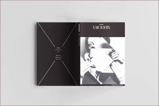
Designed by Kristen Chan | Coding supported by
Ho Chung Law | Directed by Wendy Wong


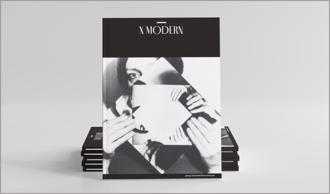
Embracing
Young Asian Canadians’ Talents
The Design Show
Presented by:


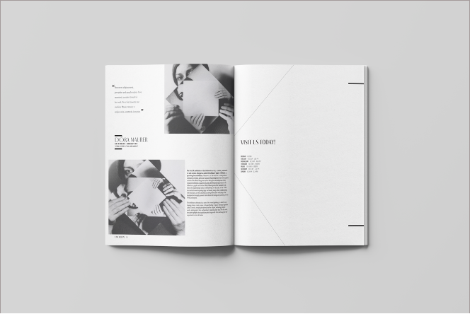
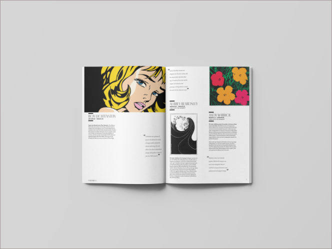
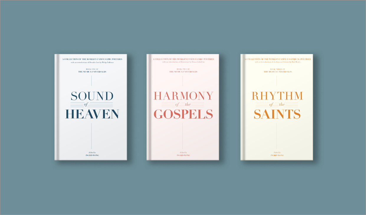
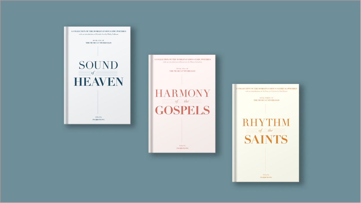
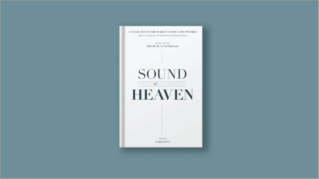
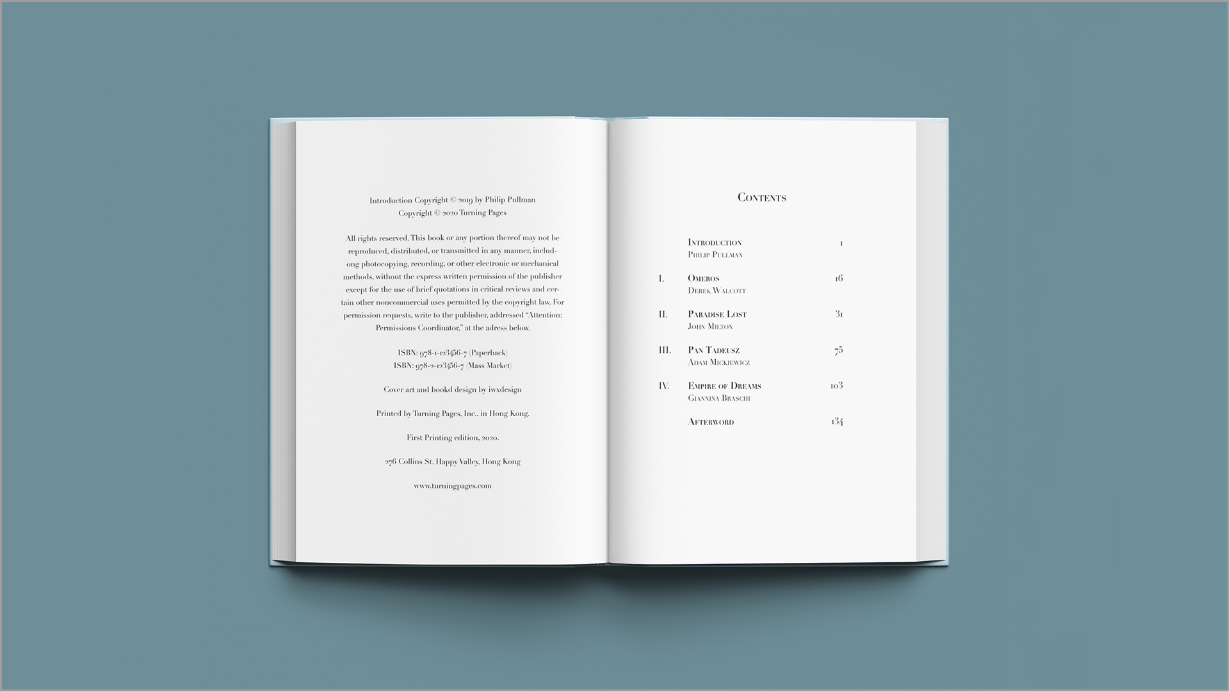
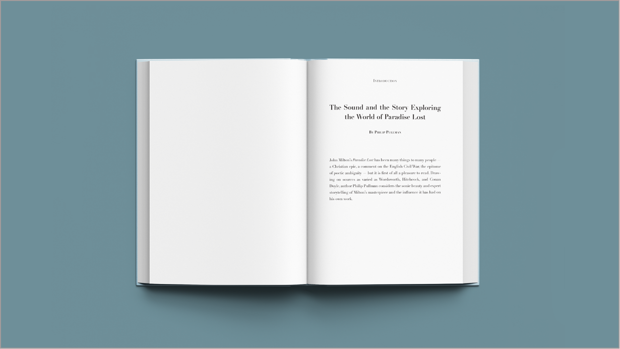
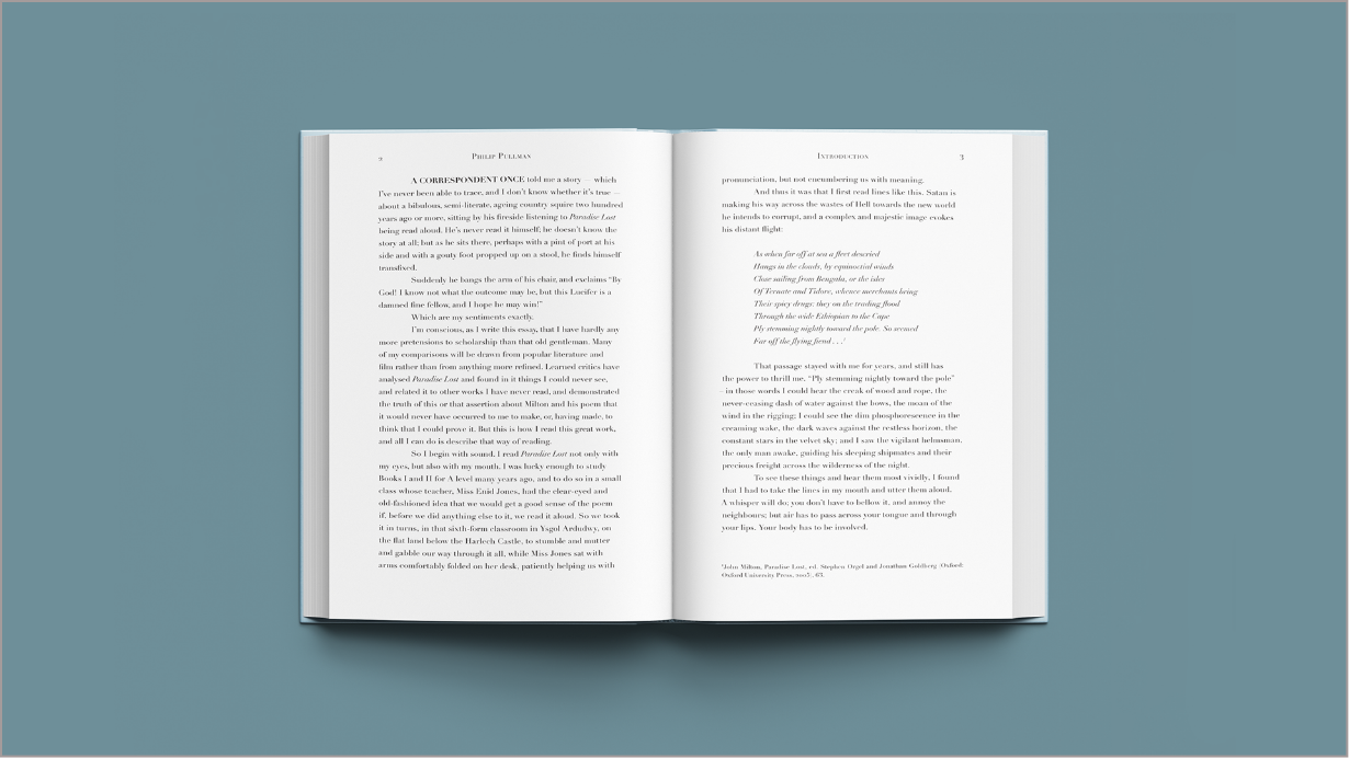
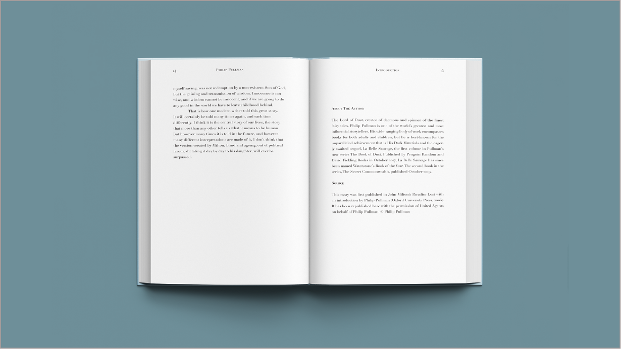
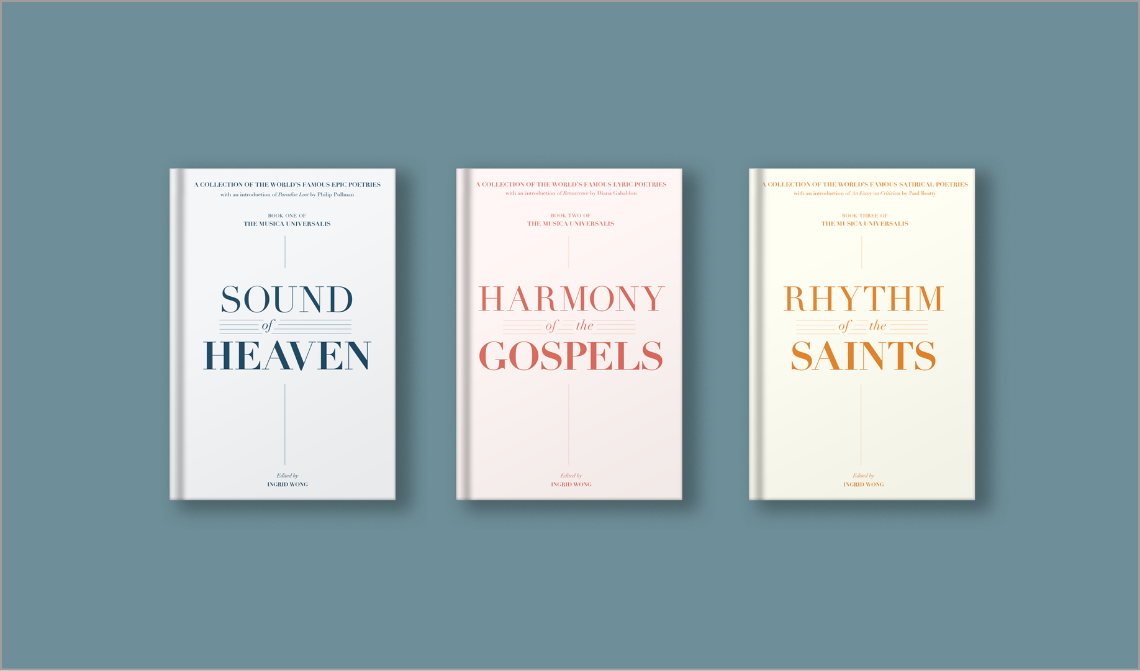
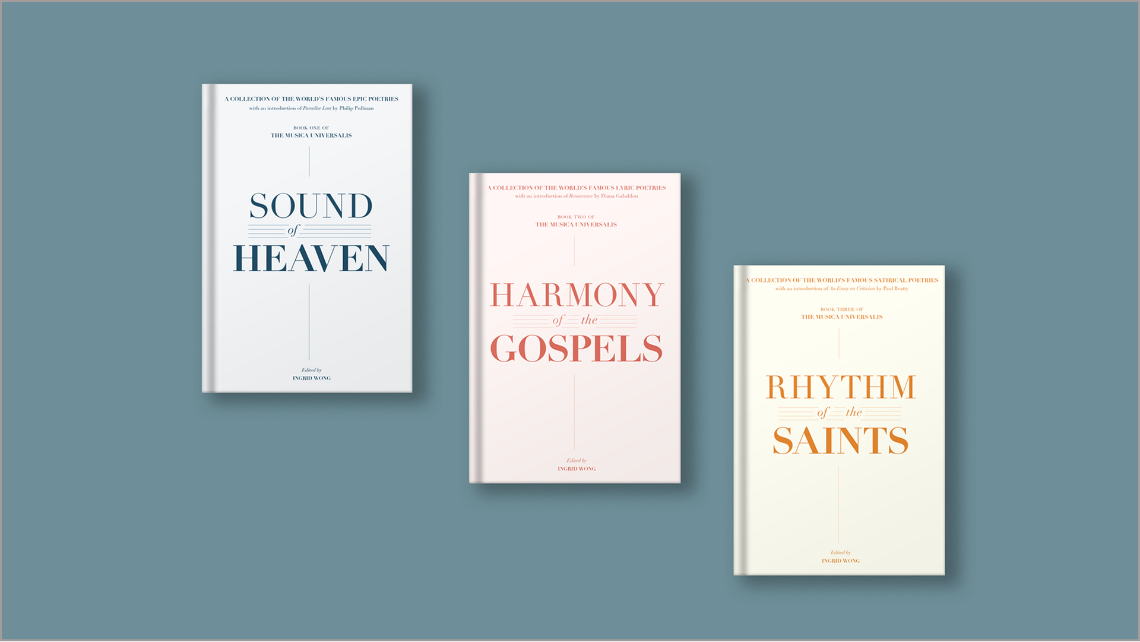
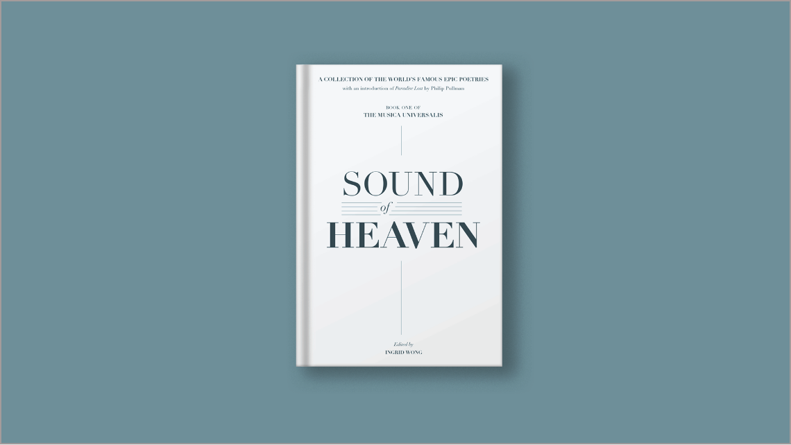
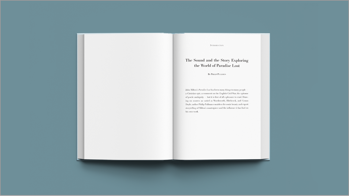
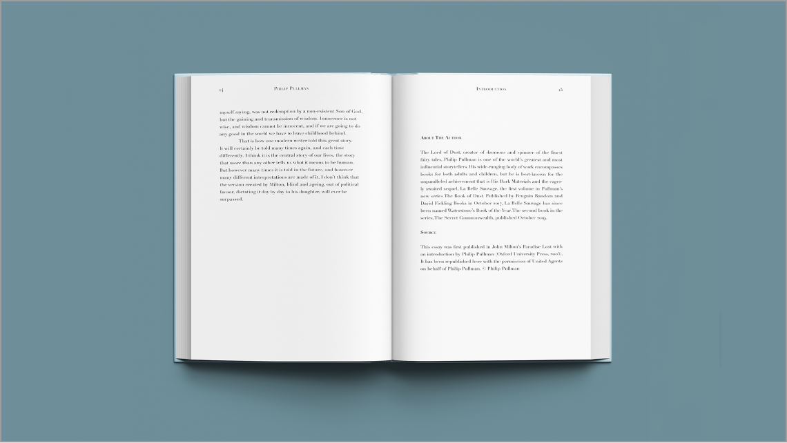
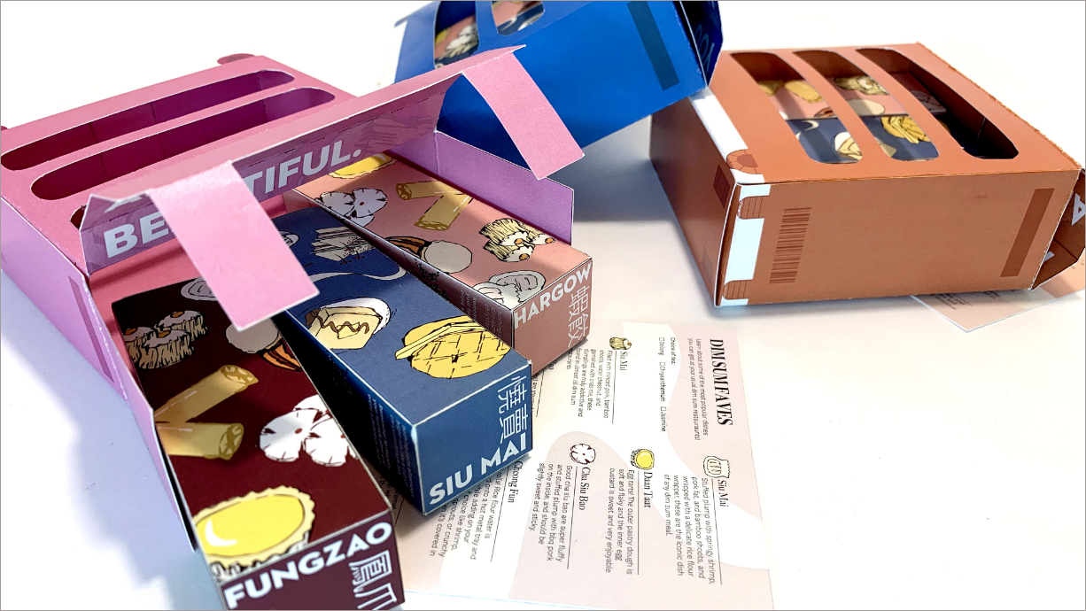
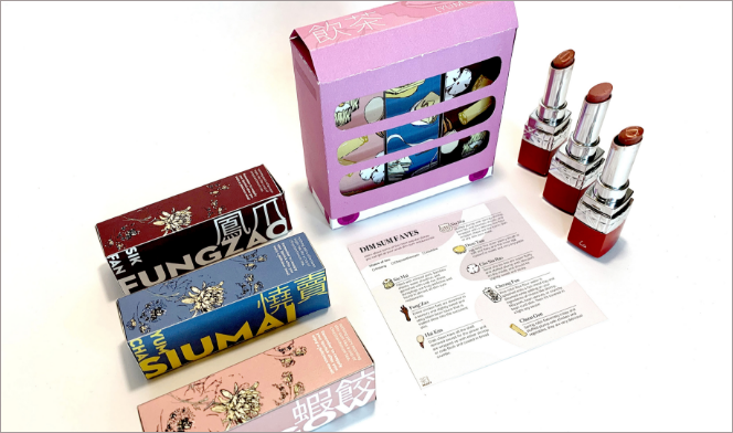
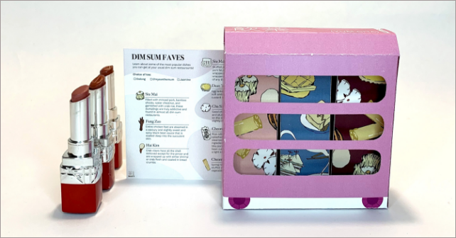
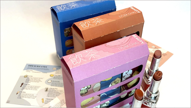
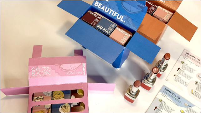
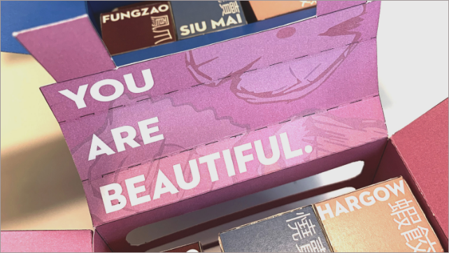
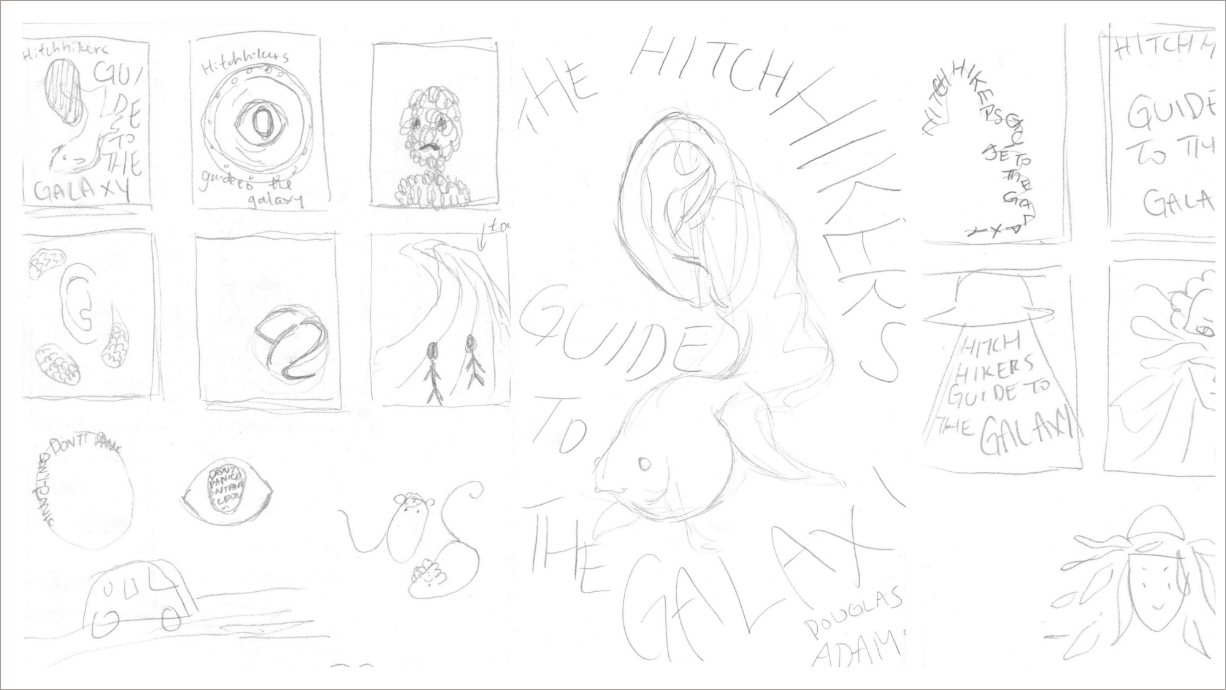
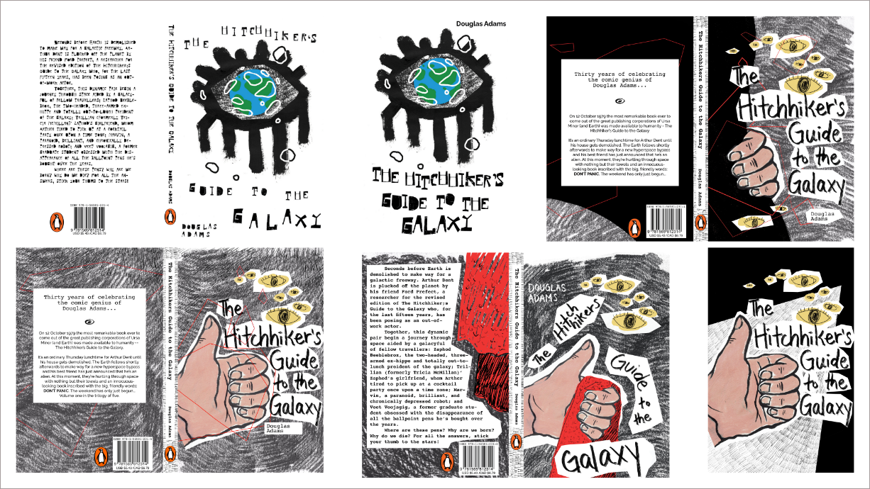
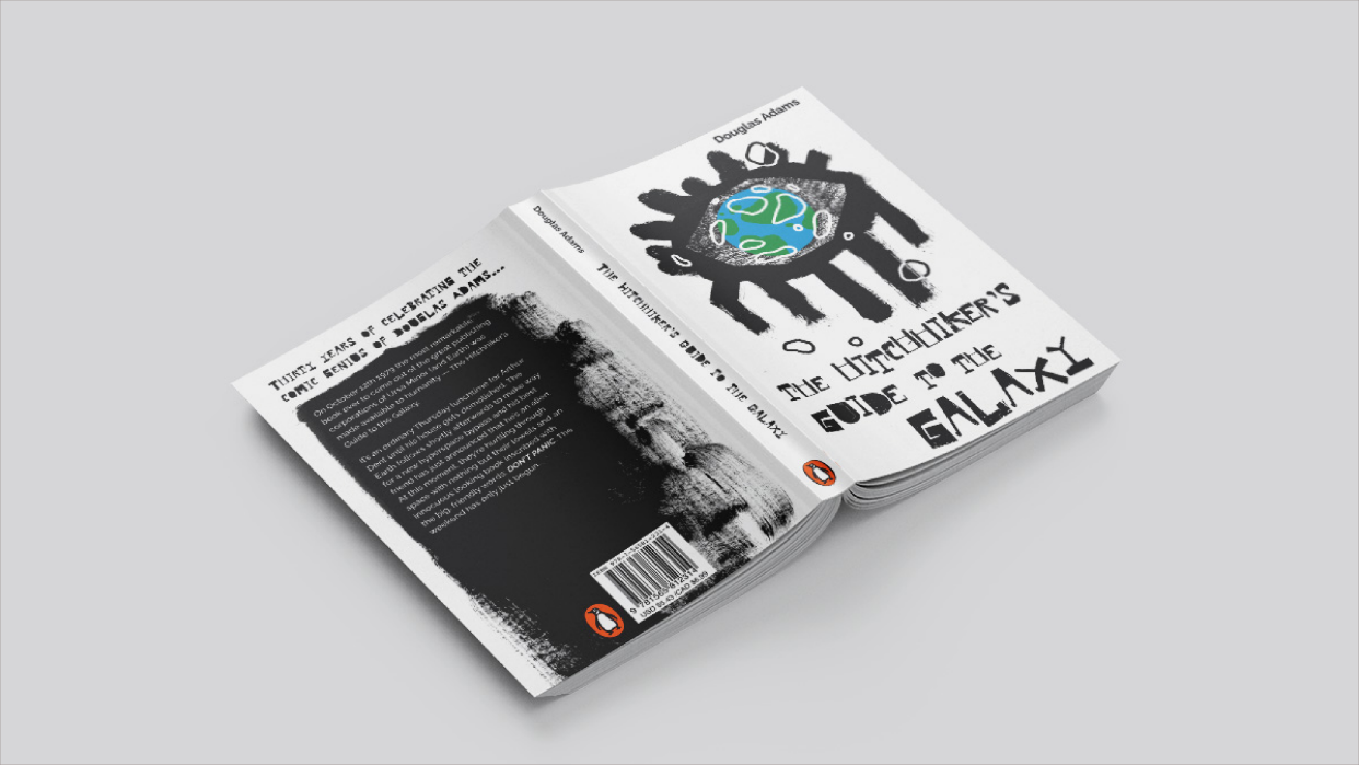
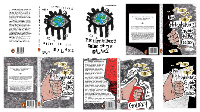
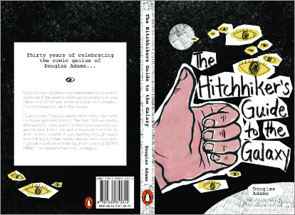
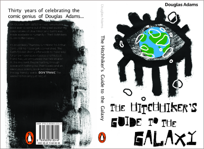
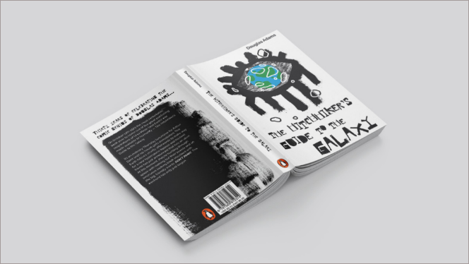
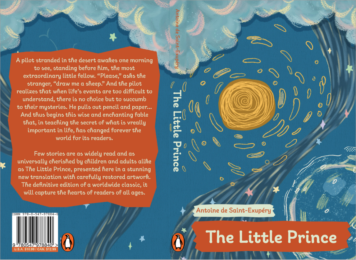
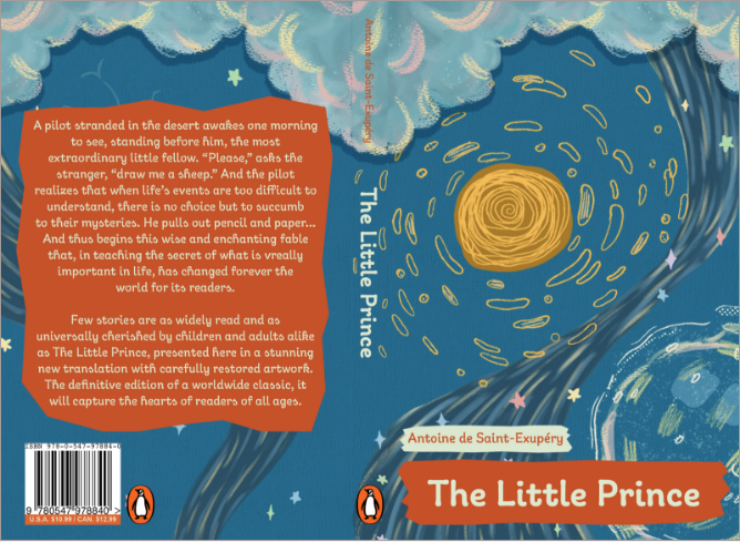
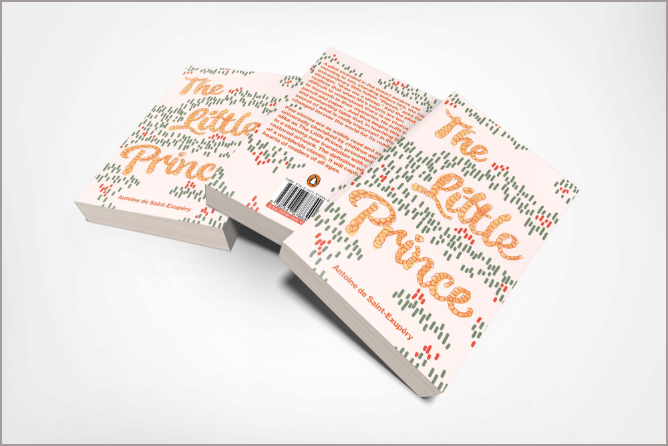
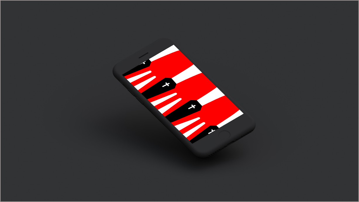
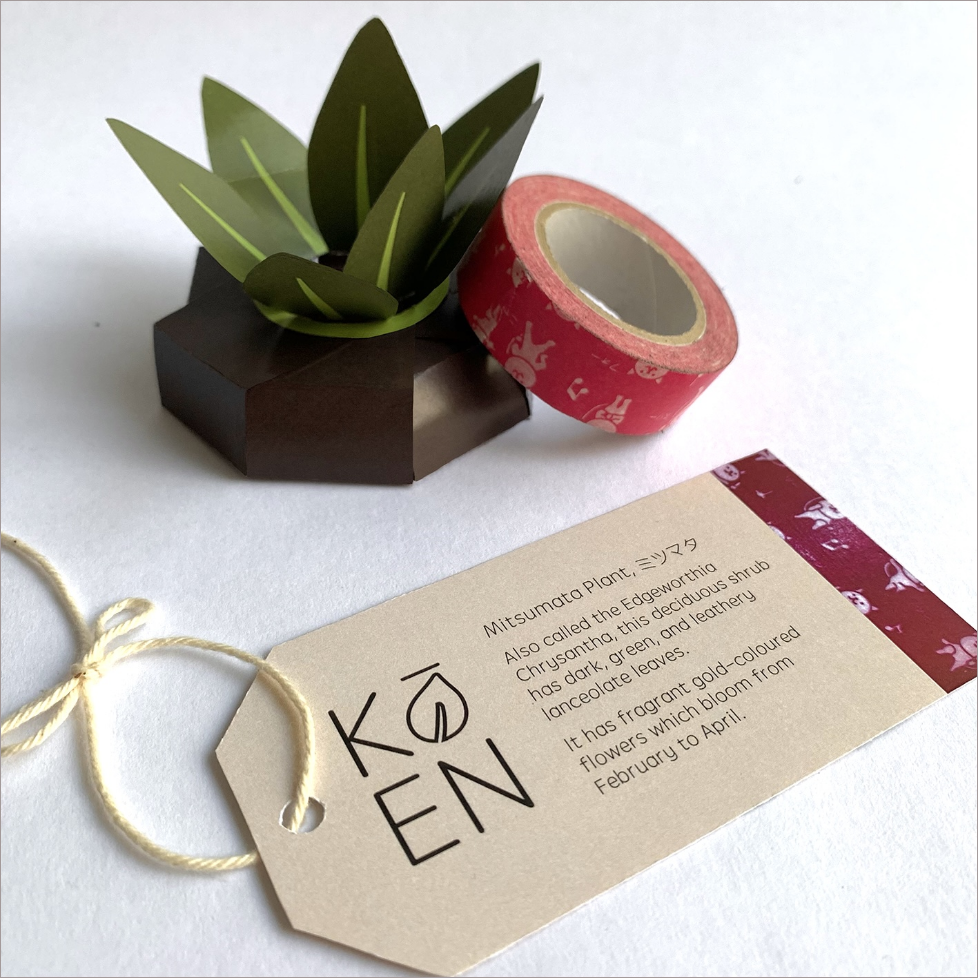
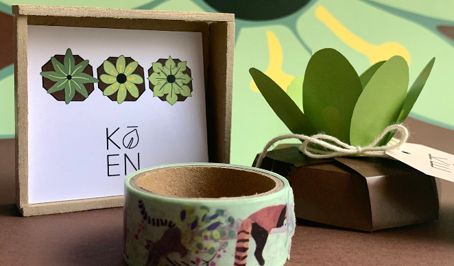
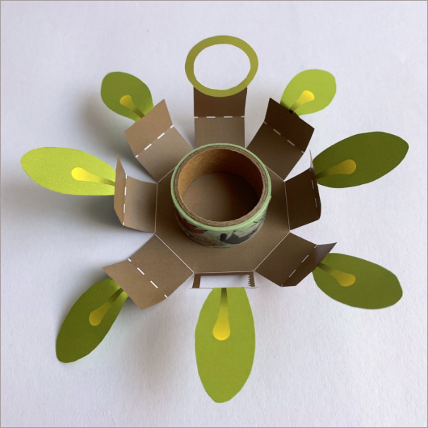
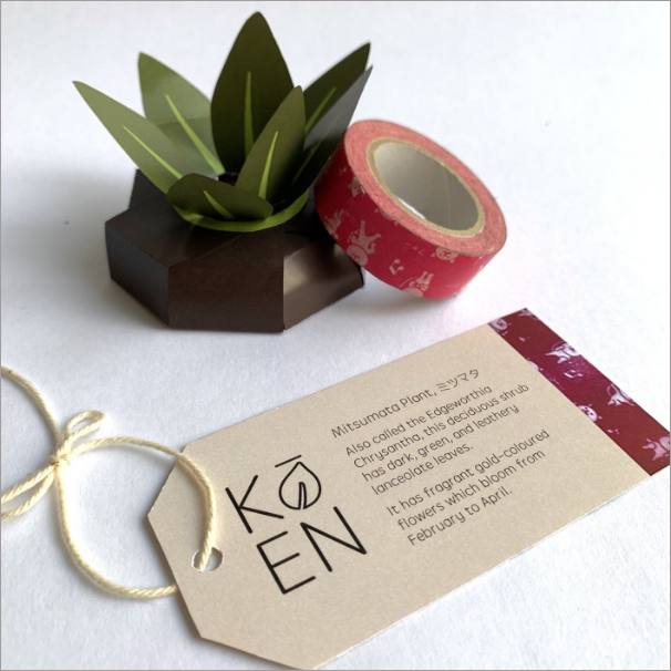
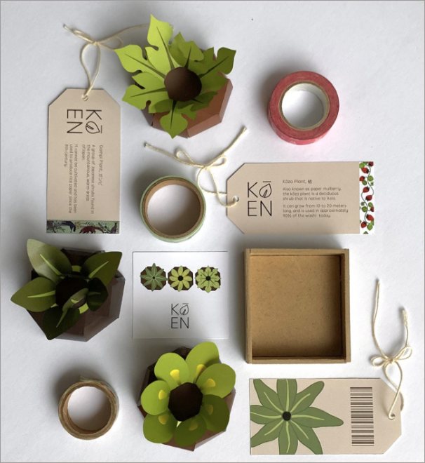
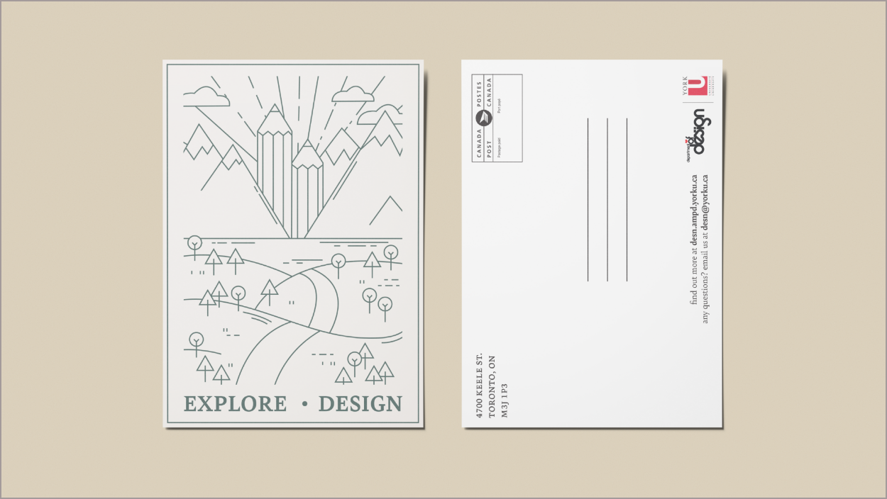
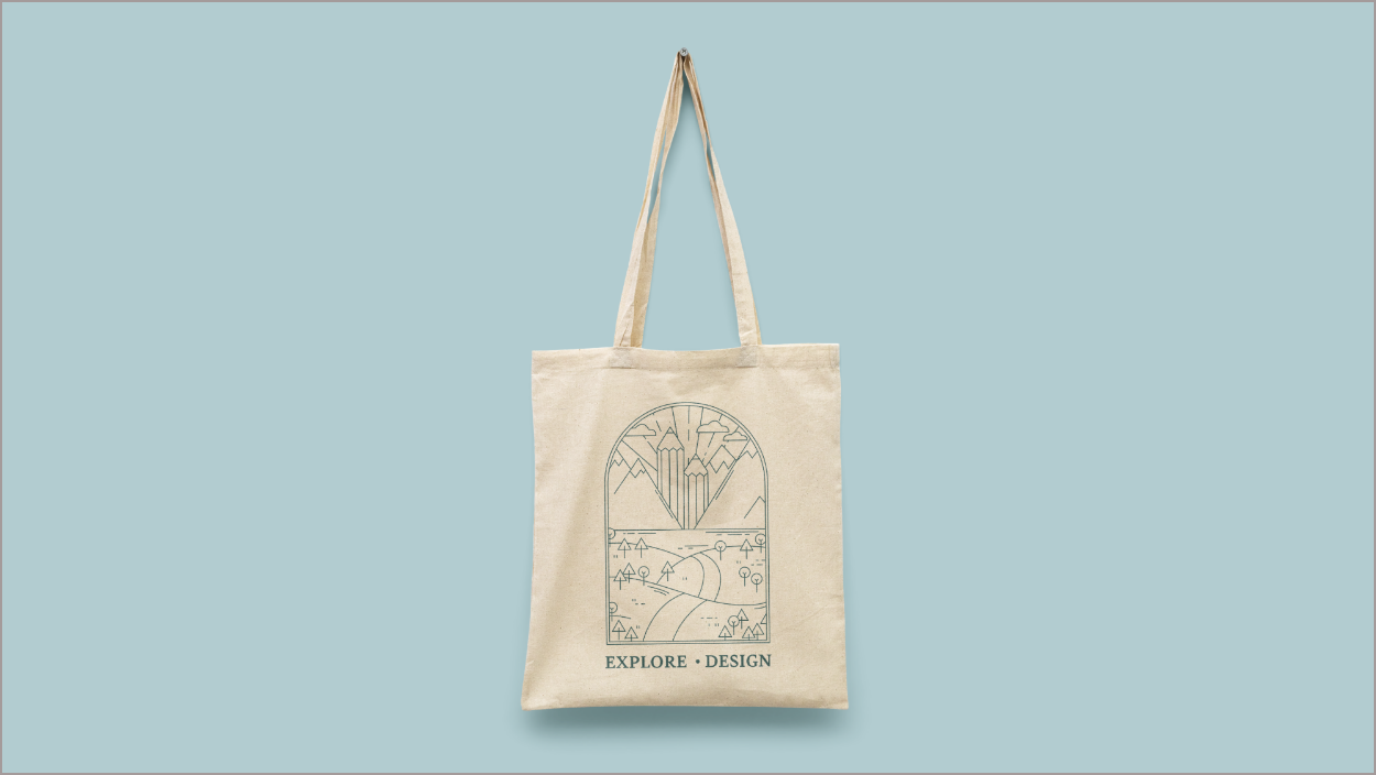
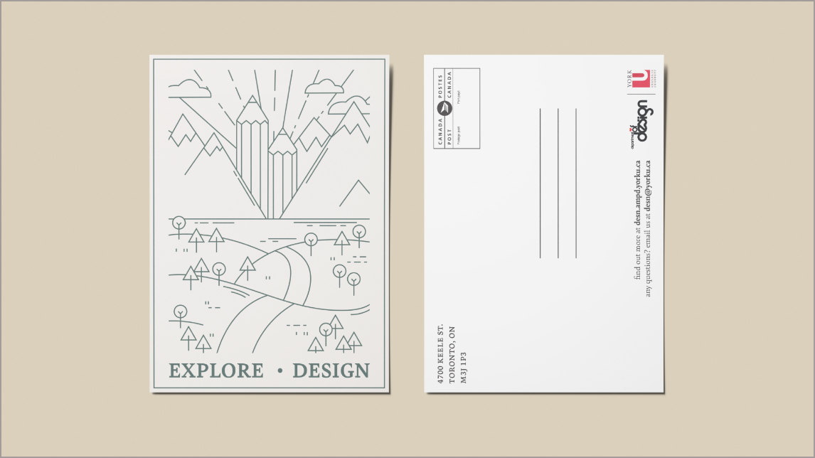
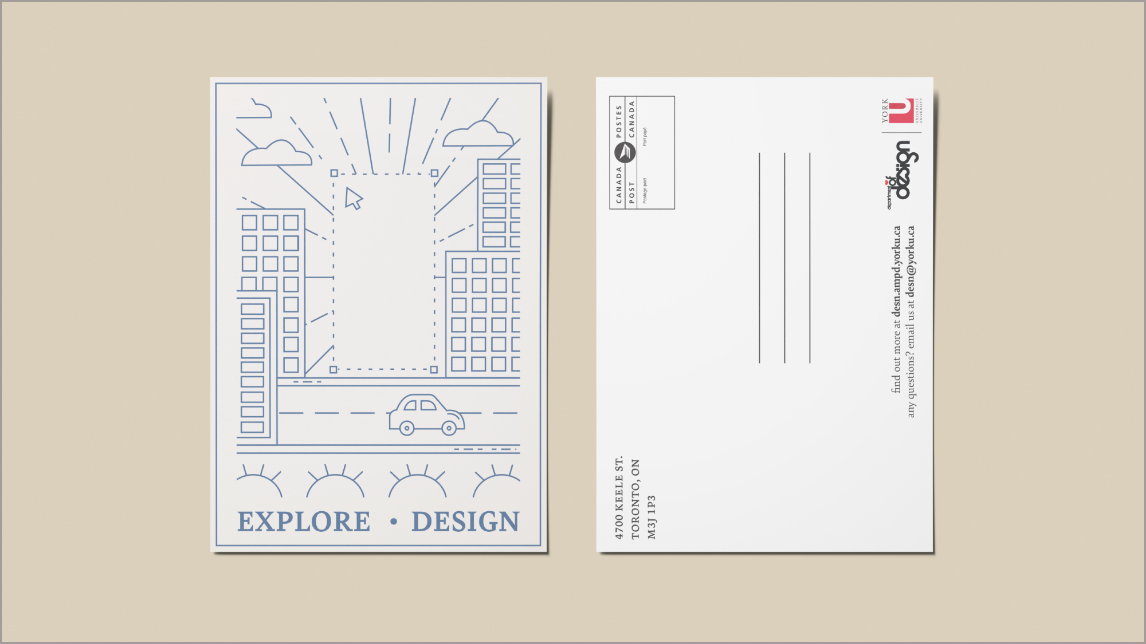
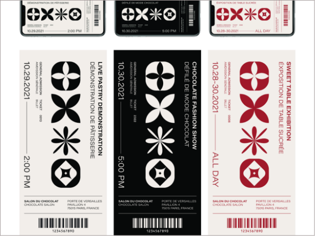
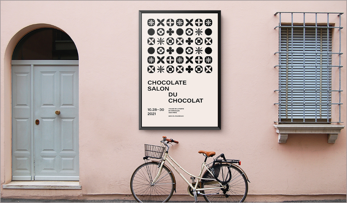
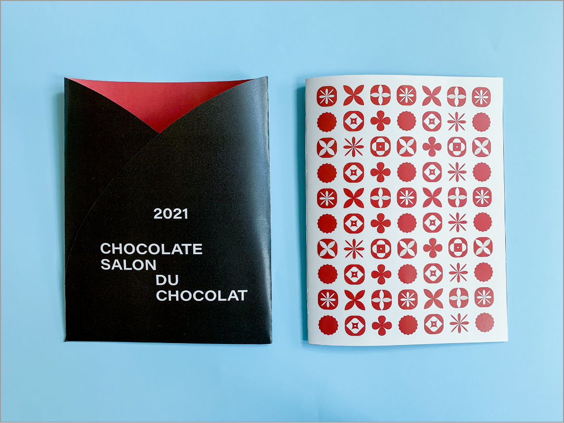
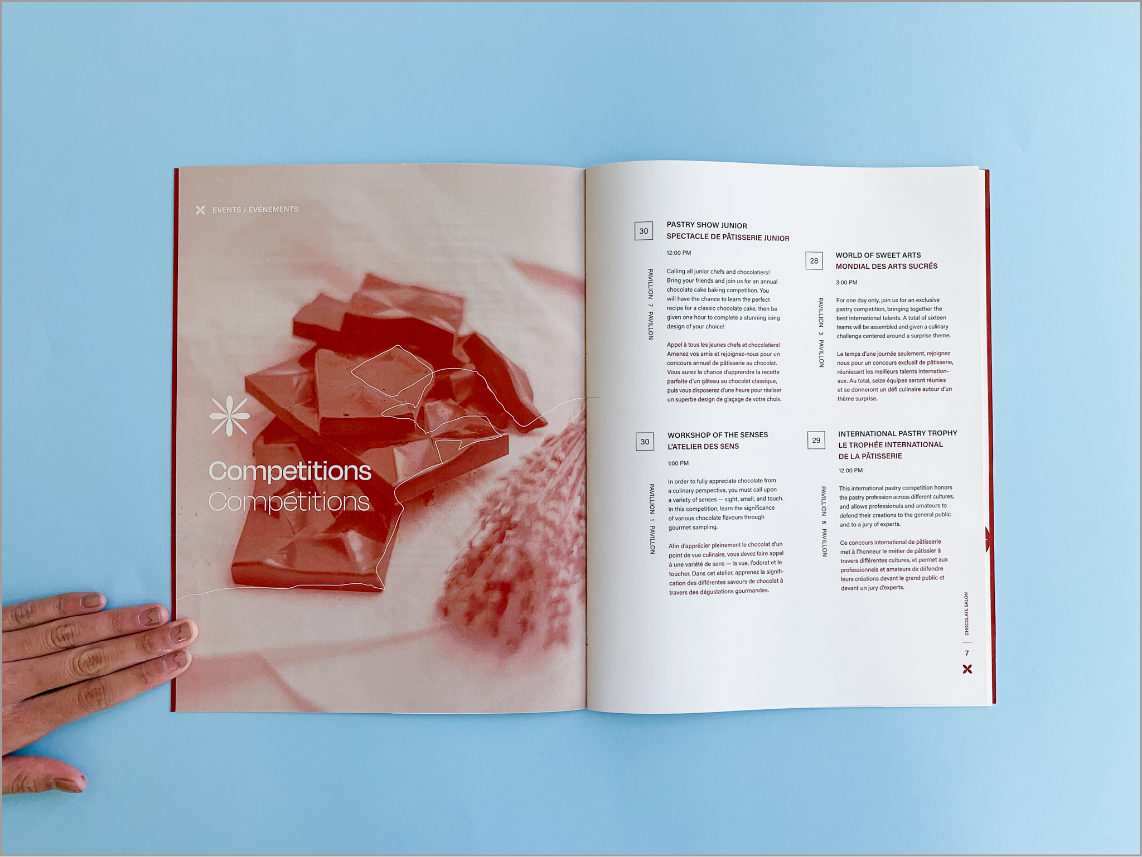
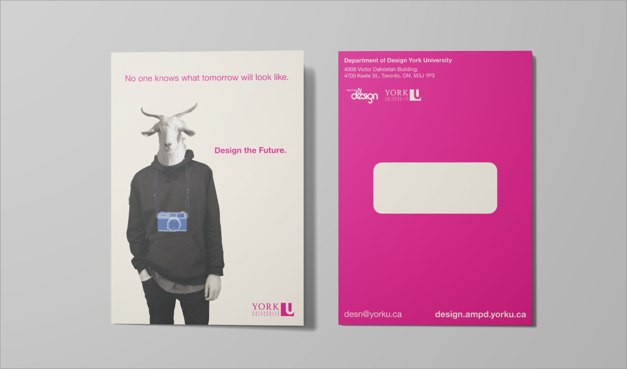
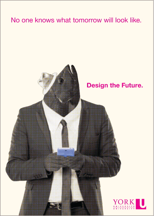
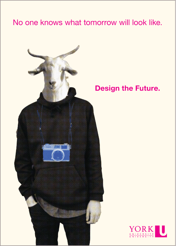
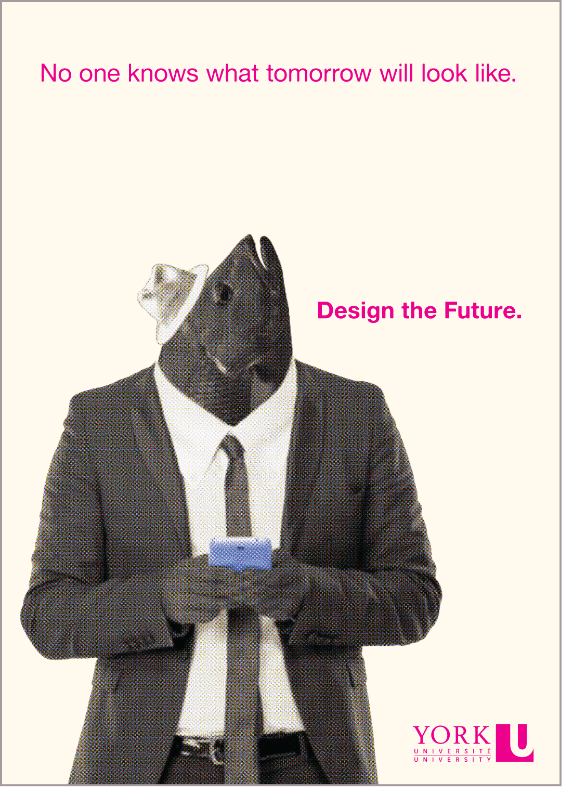
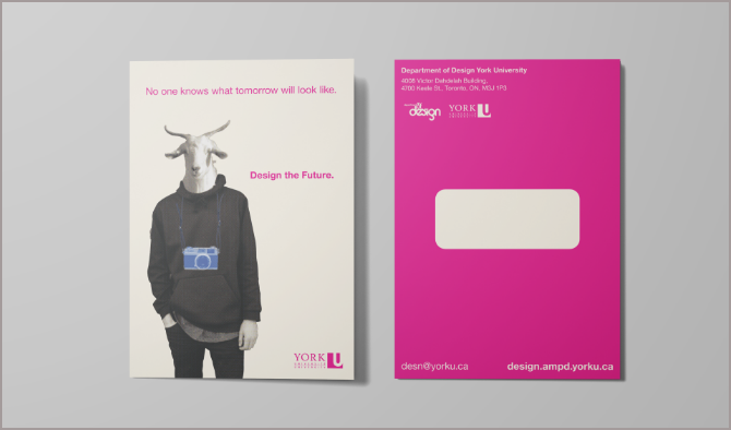
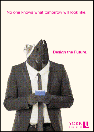
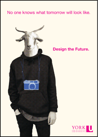
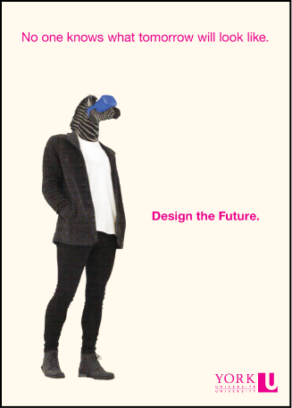
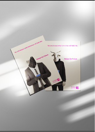
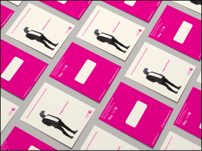
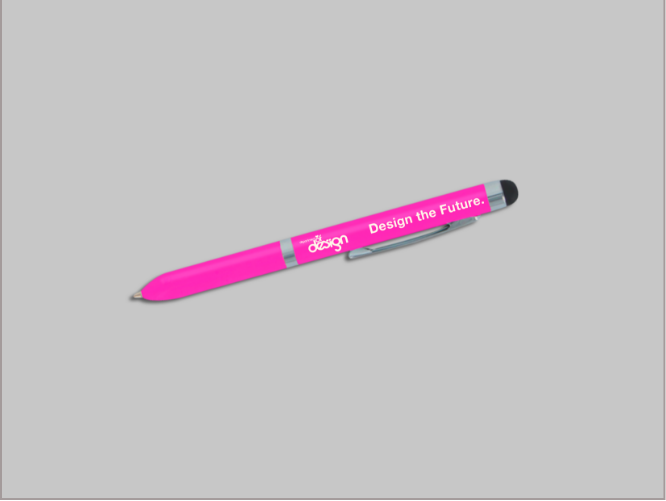
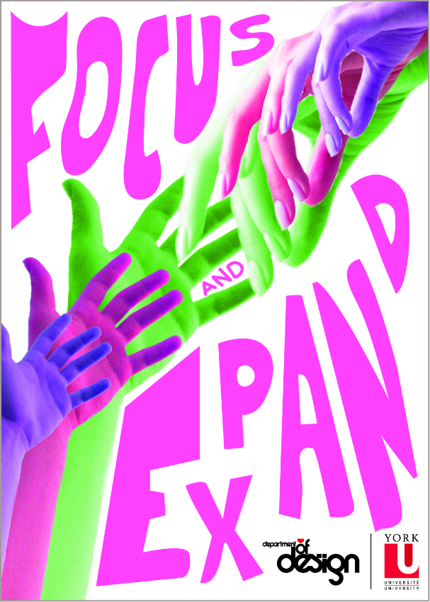
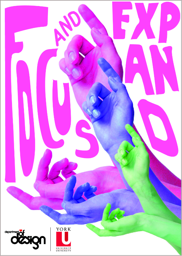
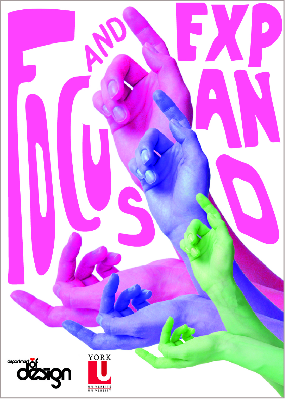
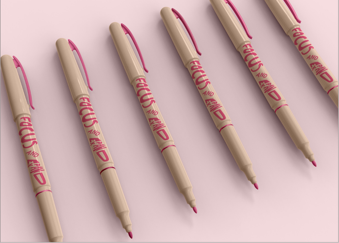
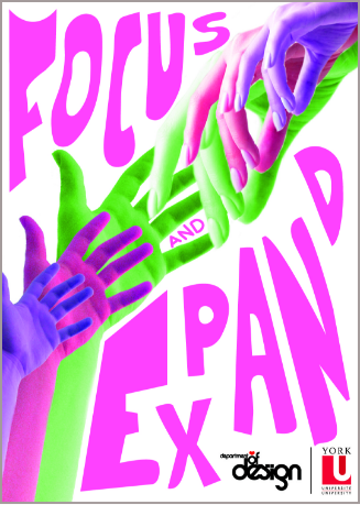
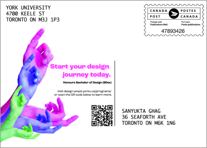
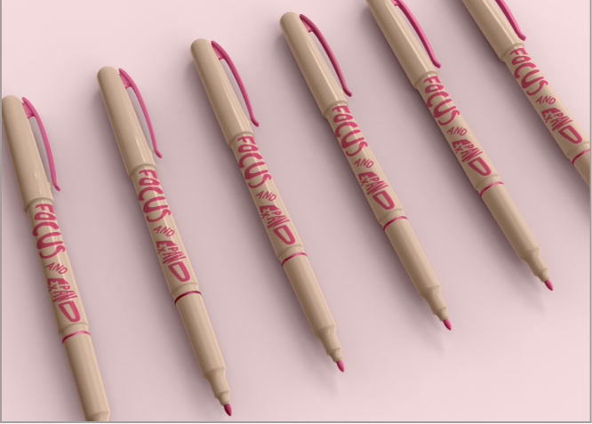
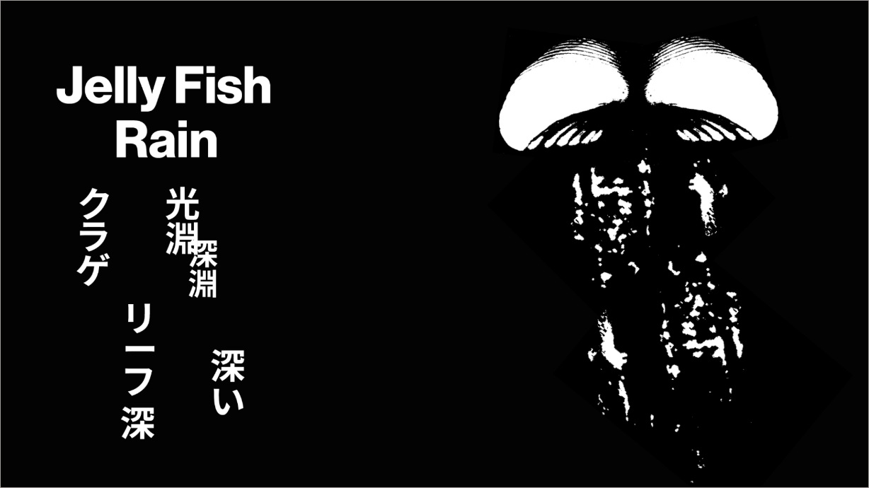
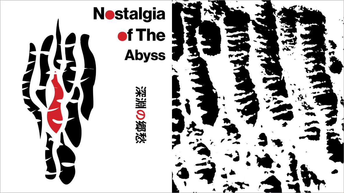
This virtual show features the work of young designers of Asian
descent who live in the Greater Toronto Area and are studying in the
Department of Design at York University. Their design works include
brand identity design, packaging design, web and user interface
design, publication design, lettering and type design, infographic
design, and motion graphics. The wide range of design works reflect
their creativity and potential as upcoming talents in our unique
multicultural milieu in Canada.
Designers


Embracing
Young Asian Canadians’ Talents
The Design Show
Presented by:


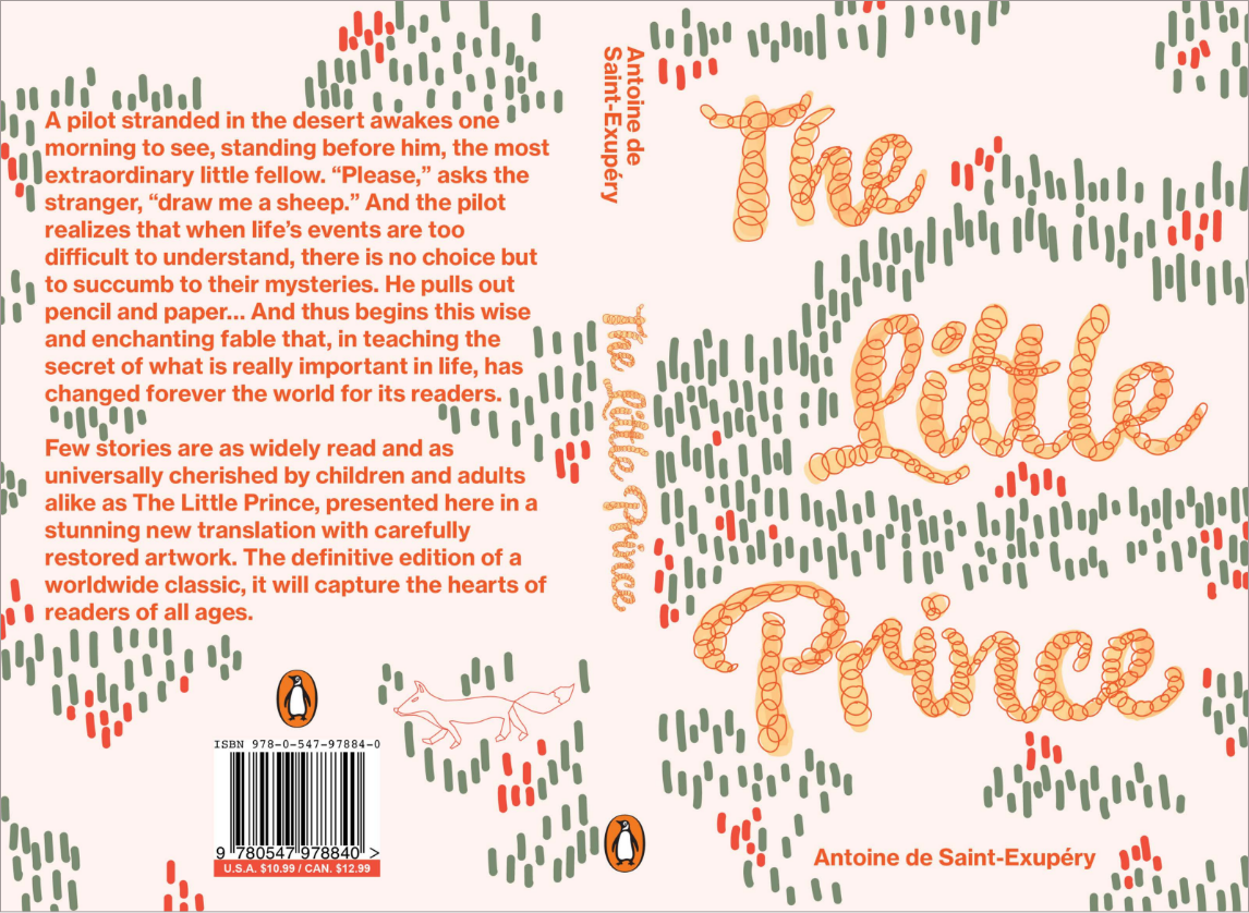
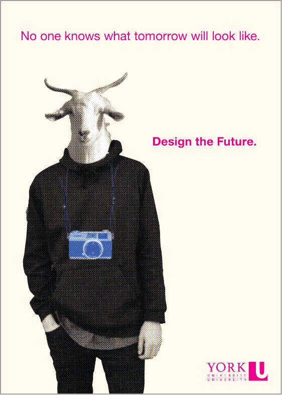
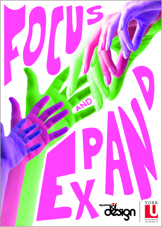
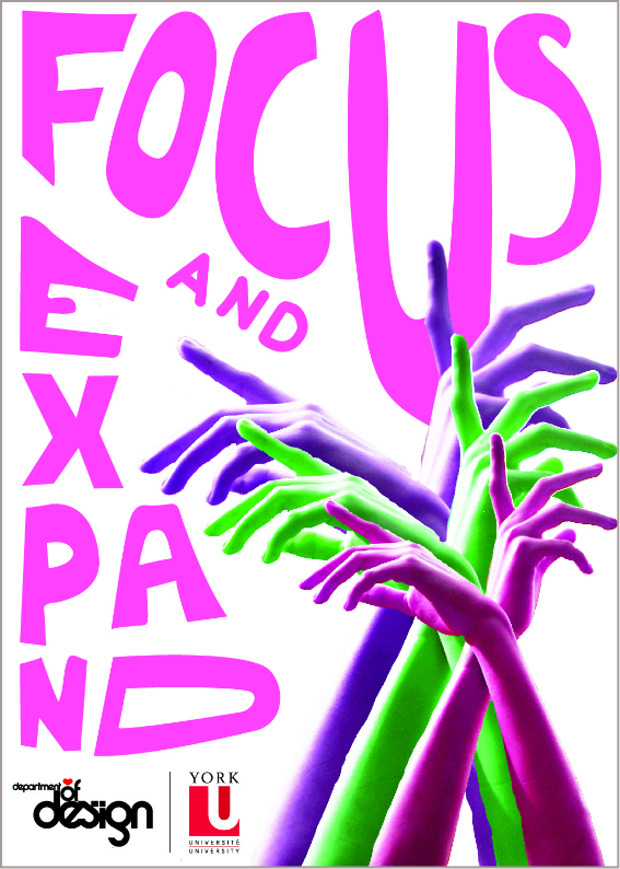
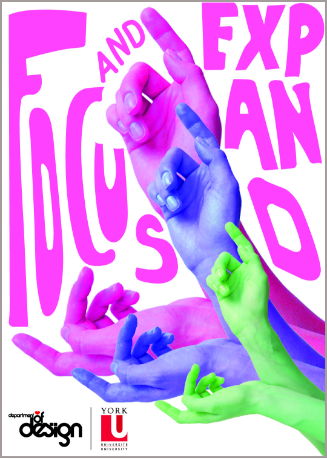
This virtual show features the work of young designers of Asian
descent who live in the Greater Toronto Area and are studying in
the Department of Design at York University. Their design works
include brand identity design, packaging design, web and user
interface design, publication design, lettering and type design,
infographic design, and motion graphics. The wide range of design
works reflect their creativity and potential as upcoming talents
in our unique multicultural milieu in Canada.


Designed by Kristen Chan | Coding supported by Ho Chung Law | Directed
by Wendy Wong


Designers


Embracing
Young Asian Canadians’ Talents
The Design Show
Presented by:

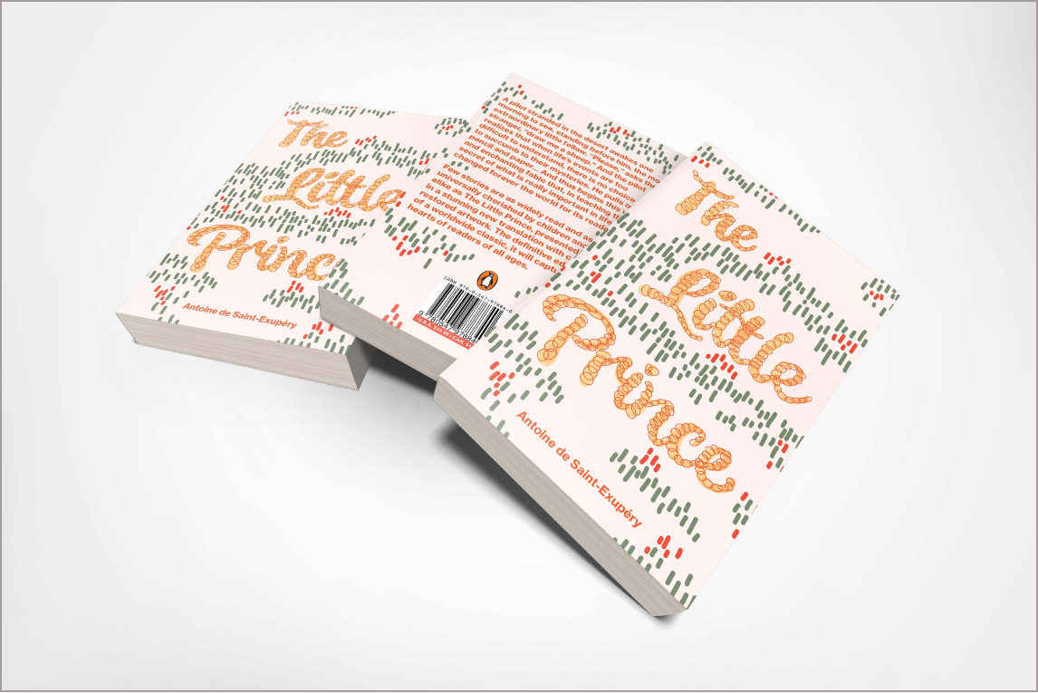
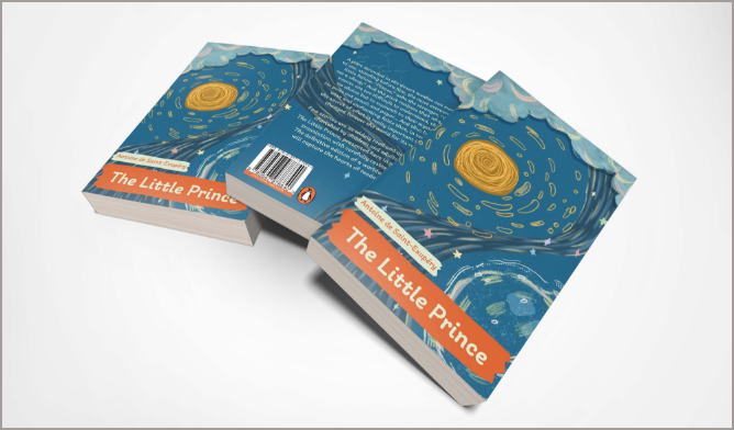
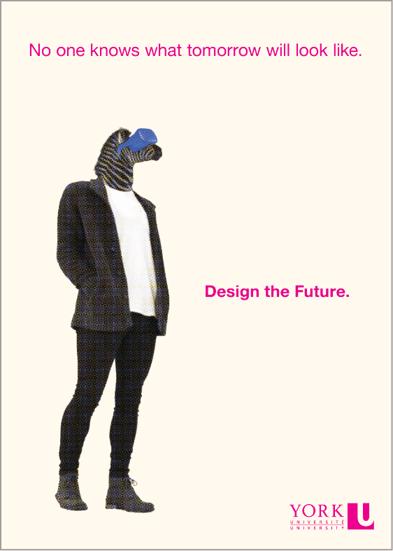
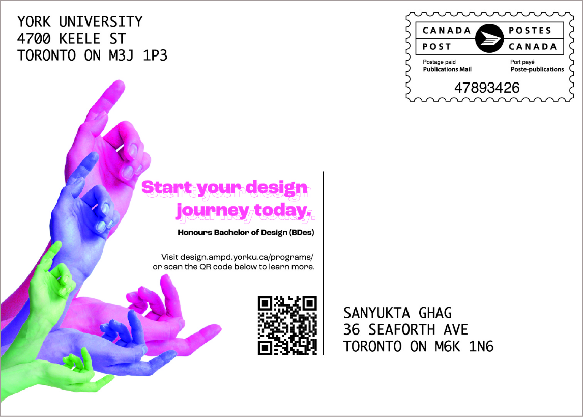
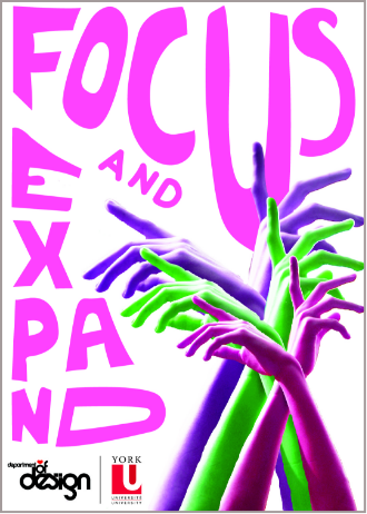
This virtual show features the work of young designers of Asian
descent who live in the Greater Toronto Area and are studying in the
Department of Design at York University. Their design works include
brand identity design, packaging design, web and user interface
design, publication design, lettering and type design, infographic
design, and motion graphics. The wide range of design works reflect
their creativity and potential as upcoming talents in our unique
multicultural milieu in Canada.

Designed by Kristen Chan | Coding supported by
Ho Chung Law | Directed by Wendy Wong


Designers