In this series, you will learn the basics of drawing and work through several lessons to design and draw your very own still life artwork. All you need is a pen/pencil and paper.
Every Monday, we will release a video and exercise on a specific drawing technique that you can practice on your own. On the Friday evening of the same week, there will be a livestream via Zoom to ask questions and share your progress. Below is the lesson schedule.
Lesson Schedule
Why line?
Line is one of the single most important aspects of drawing. Lines can create shape, form, pattern, texture, space, movement, value (the lightness or darkness in a drawing), and even emotion.
What is line?
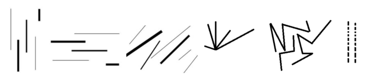
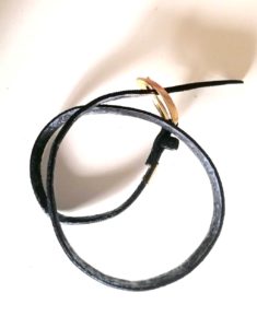
Technically, line is just the path of movement from one point to another. Line can be 2-D (a pencil mark), 3-D (a wire), or implied (the dashed road lines). Some other types of line are listed below, but when it comes down to it there are only 2 kinds of line: straight and curved.
Types of Lines
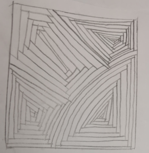
Exercise #1: Repeat that Box!
This exercise works on our hand-eye coordination and repetition. Create your own unique pattern for this! Take it slow and have fun with it.
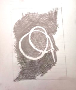
Line as Emotion
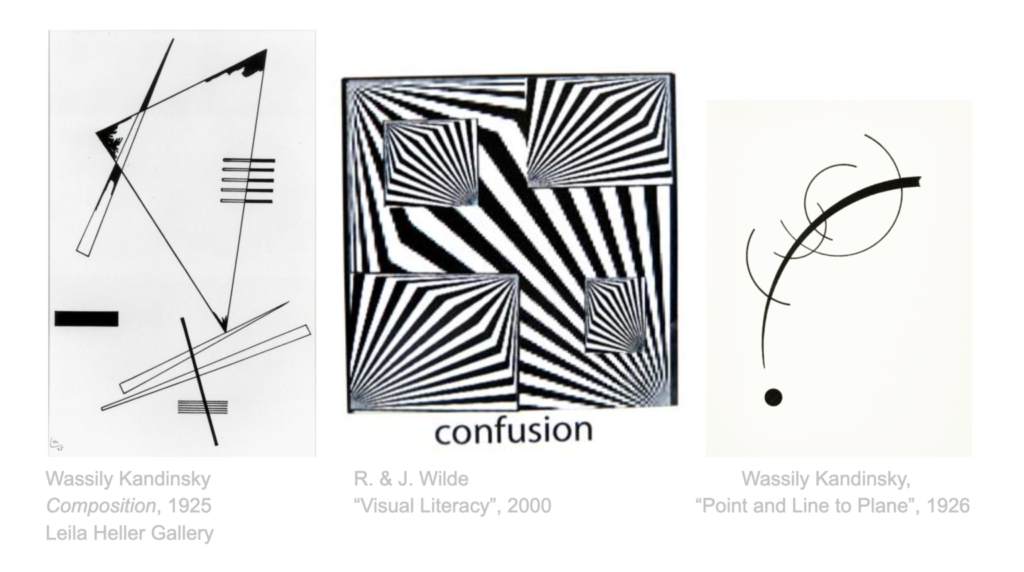
Lines can suggest emotion, and even be representative of emotion. Look at some of the abstract drawings (art that doesn’t strictly represent reality - a drawing of a hand is not abstract, but a drawing of lines showing the feeling of something soft would be) below to get your own ideas about line and emotion. How does the art make you feel? What does it make you think of?
Exercise #2: Feelings? Lines? Both? More?
This exercise aims to not only explore lines as representations of feelings, but also as experiences! Using only lines, draw representations of not only the following emotions, but also experiences:
- Sad
- Frustrated
- Angry
- The alarm at 5 a.m
- Biting into a hot pepper
- Your favourite song
- Social distancing
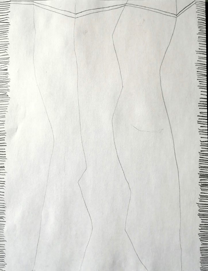
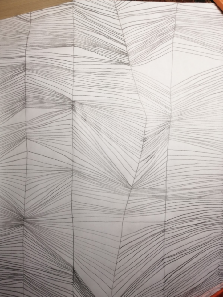
The image on the right above is an example of a finished product, also found at the end of the video. As you can see, every line connects to the far left line and the far right line on the paper.
Why shape and value?
Whether you know their names or not, you're using the elements of art every time you draw something. Every element of art works together to create a whole piece, including these two. Shape and value work together to add depth to a drawing. Artists see the world around them in basic shapes and their light values.
What is shape? What is form?
Shape is an area enclosed by line or colour; it is two-dimensional and defined by height and width. Form is similar, but is three-dimensional; form is defined by height, width, and depth.
Geometric vs Organic Shapes
Geometric shapes are mathematical; they include named shapes such as the cube, cylinder, rhombus, trapezoid, and sphere. These are often man-made but can be seen in nature (such as the honeycomb). Organic shapes are unnamed. They’re usually free-flowing and asymmetrical.
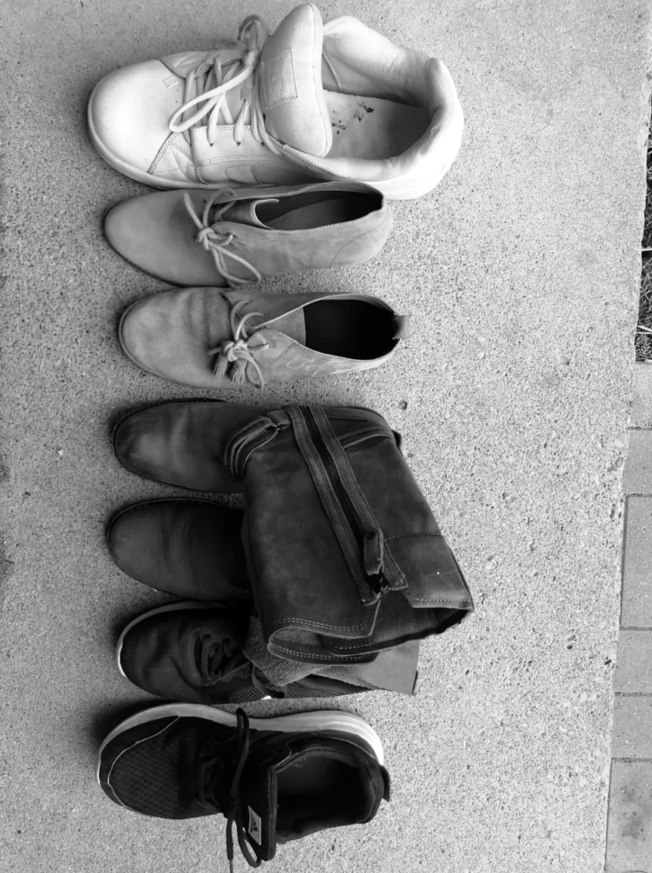
Exercise 1: Found objects
For this exercise, find two objects in your home and draw them using only simple shapes. One object should be simple (ex. a cup, a book, a box), and the other more complex (ex. a lamp, a cat toy, a jump rope). Begin with the simple object.
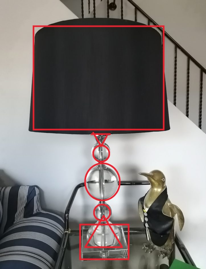
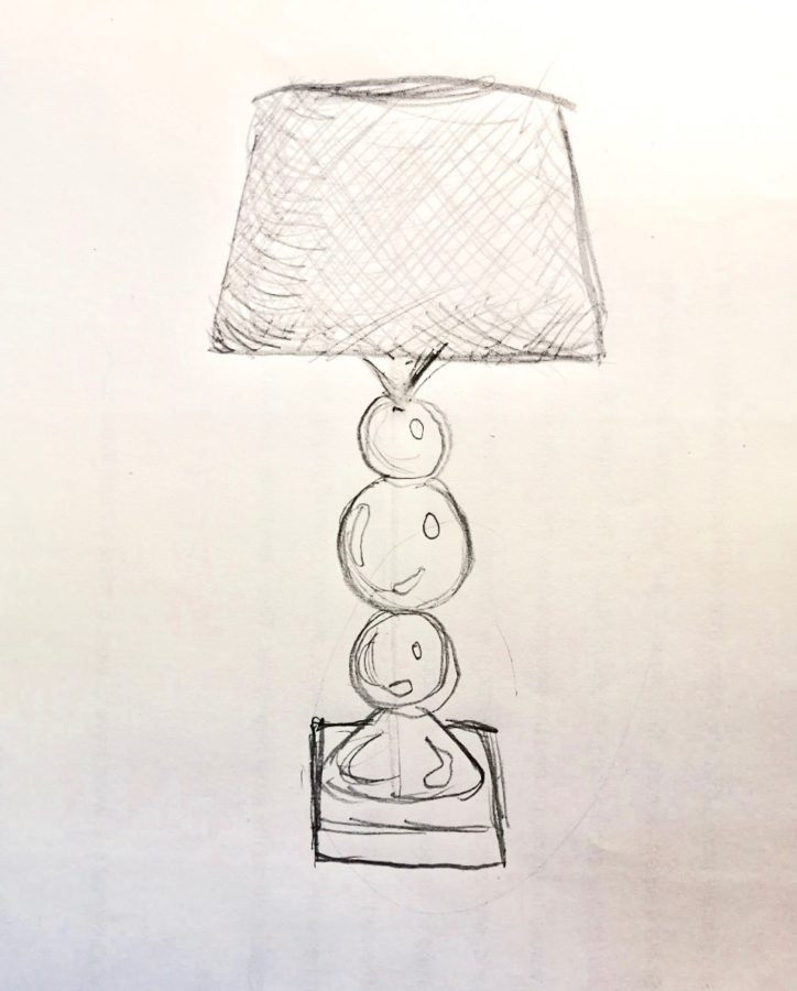
- Look at your object. Think of what shapes it consists of - are there stacked circles? A cylinder? A rectangle? A cone? Where are these shapes?
- Draw the shape that is most apparent to you.
- Continue drawing additional shapes until it resembles the object without details.
- Add in details if desired. Details can include colour, highlights, and patterns.
Tip: If you’re struggling with this and have access to a printer, print out photos of objects and animals in black and white! Then you can draw directly on your paper to try and figure out what shapes make up a form.
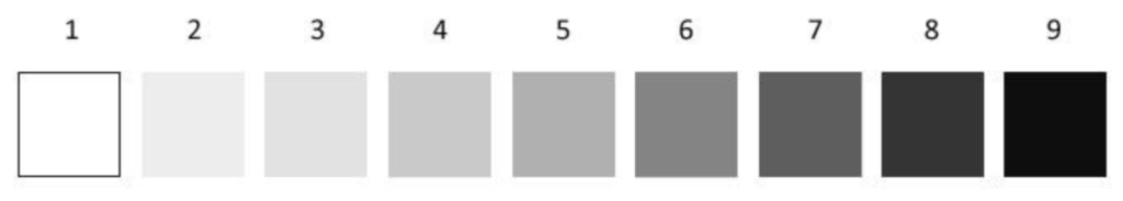
What is value?
Value is the amount of lightness or darkness in a picture. You can also think of it as the amount of light reflected off a surface. This means value needs a light source.
Value Scale:
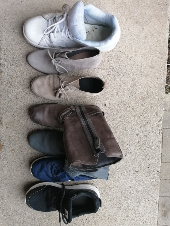
Exercise 2: Photographic Value Scale
For this exercise, we’re making our own value scale using objects we find at home. Objects you could do this with include books,ribbons, wrapping paper, fruits, vegetables, or anything else - it’s all up to you.
- Find at least 5 items of various levels of darkness and lightness
- Arrange these items in a line from lightest to darkest
- Take a photo of the items
- Change the photo to black and white (most phones and computers can do this under “edit” in the photos app)
Notice how the colour of an object impacts its value! Does your value scale change if you put it in different lighting? What if it’s outside? What if you shine a lamp directly on it?
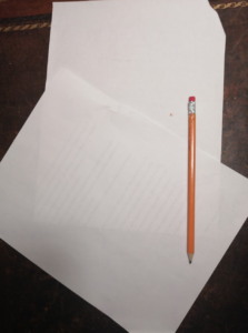
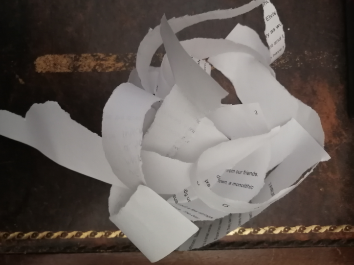
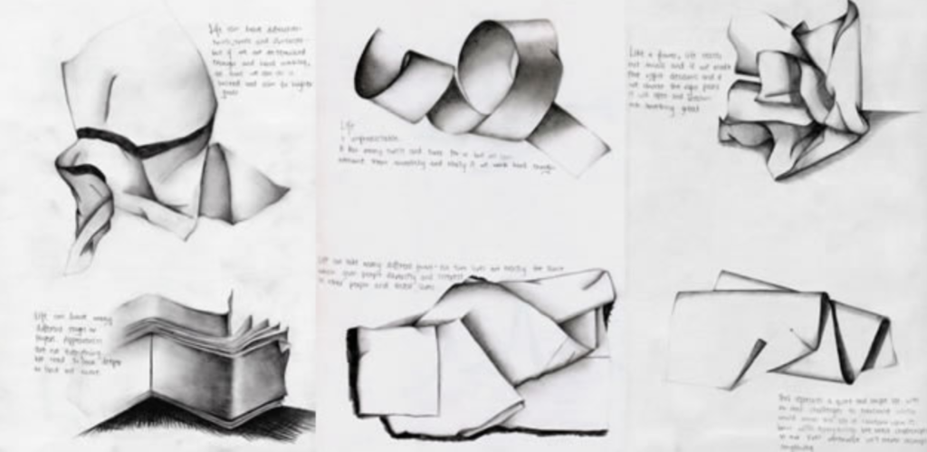
The Challenge: Particular Paper
For this challenge, you’ll be creating a free-standing abstract paper sculpture that represents a feeling, experience, or emotion; then you will draw it.
Materials:
- 2 pieces of paper
- Pencil
- Think of a feeling, emotion, or experience. How are you feeling right now? What was the best thing that happened to you last week - how did that make you feel?
- Once you know what feeling, experience, or emotion you want, sculpt one piece of paper to represent that. You can rip, tear, shred, and fold. You cannot use scissors, glue, or tape.
- Find somewhere to put the sculpture. Make sure there’s enough light you can see it.
- Using the other piece of paper, draw your paper sculpture. Here are some things to consider when drawing:
- The value - where are the shadows? Do the shadows end abruptly or slowly smooth into light?
- The shape - do you recognize any of the shapes? Are the lines created curved or straight? Is there a lot of space in my picture, or is the paper smushed together?
Here’s an example that was done by art student Jenny Ha.
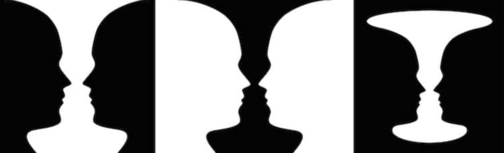
Why space? What is space?
Space is one of the seven elements of art. Space is always part of an artwork - whether it’s a sculpture, logo, painting, or drawing, it will have space. In sculptures space is physical and 3D; but in drawings, space is how the artwork is organized on a page.
Negative space and Positive Space
Positive space is the focus of the image, the object itself. Negative space is the space between, within and surrounding an object in an image. It shares edges with the positive space, defining the outline of the object and creating proportion.
Exercise 1: Negative Nelly
- Find an object in your house that is relatively simple but not a geometric (so a belt is okay, a book is not)
- Draw the negative space of the object. That is the space the object is not in. Your lines should be where the object and negative space meet up.
- Do not just draw the outline of the object - we are not drawing the object, we’re drawing the space it isn’t in.
- Fill in the negative space. I cross-hatched, but you can fill it in any way you want.
How do artists show space?
- Size relationship: As your eye moves toward the background of an image, objects in it gradually become smaller.
- Placement of objects: In drawings, objects placed high appear further in the background.
- Overlapping objects: To overlap is to place one object behind another, partially hiding it. This is one of the easiest and most effective ways to show space.
- Value change: Throwback to our previous video! The further back an object is, the less detail and value contrast is has
- Details: Details of an object in the background as less clear than those in the foreground
- Atmospheric, or aerial, perspective: This is described in greater detail in our value video. Objects in the background are lightened
- Linear perspective: A system to create depth where parallel lines appear to meet at one point (converge)
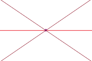
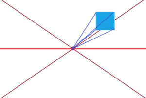
The 4 Parts of One-Point Linear Perspective
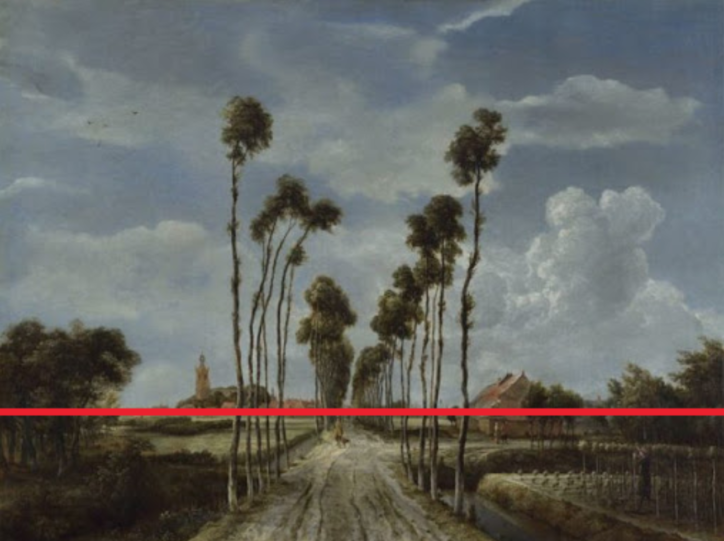
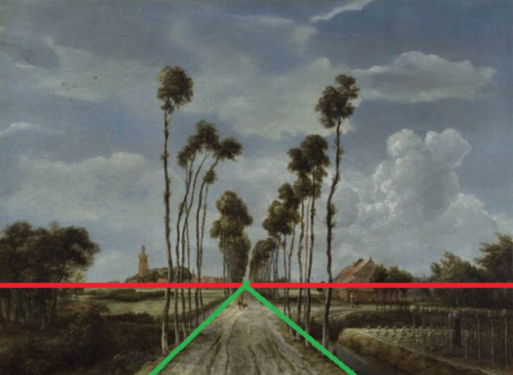
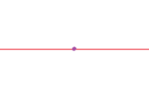
Horizon line: The horizon line is a horizontal line drawn across the picture. This is eye level to whoever is looking at it
Vanishing point: The vanishing point is an imaginary point on a drawing where lines all meet up. All the parallel lines converge to the single point.
Receding lines: Receding lines are the lines that meet into the vanishing point
Vertical and horizontal lines: Vertical lines in a drawing are always vertical, horizontal are always horizontal.
Exercise 2: Linear Perspective Cubes
For this exercise, you will draw at least 3 cubes in a one-point perspective.
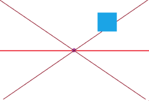
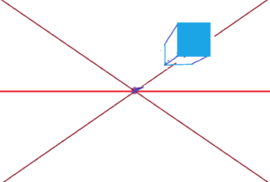
- Draw a horizontal line in the centre of your paper
- Draw a circle near the middle of this line - this is your vanishing point
- From each corner, draw a diagonal line that goes through your vanishing point. It should look like a big X across your page.
- Draw the face of a cube anywhere on your paper. This should just look like a normal square or rectangle
- From each corner of your square or rectangle, lightly draw a line that converges to the vanishing point. These receding lines are what creates the perspective.
- Finish the cube by closing the box - draw a vertical line and horizontal line within the receding lines.
- Erase the receding lines that aren’t in your cube.
- Draw at least 2 more cubes.
The Challenge: Why You Gotta Be So Negative?
For this challenge, you’ll be doing another negative drawing but making it more complex.
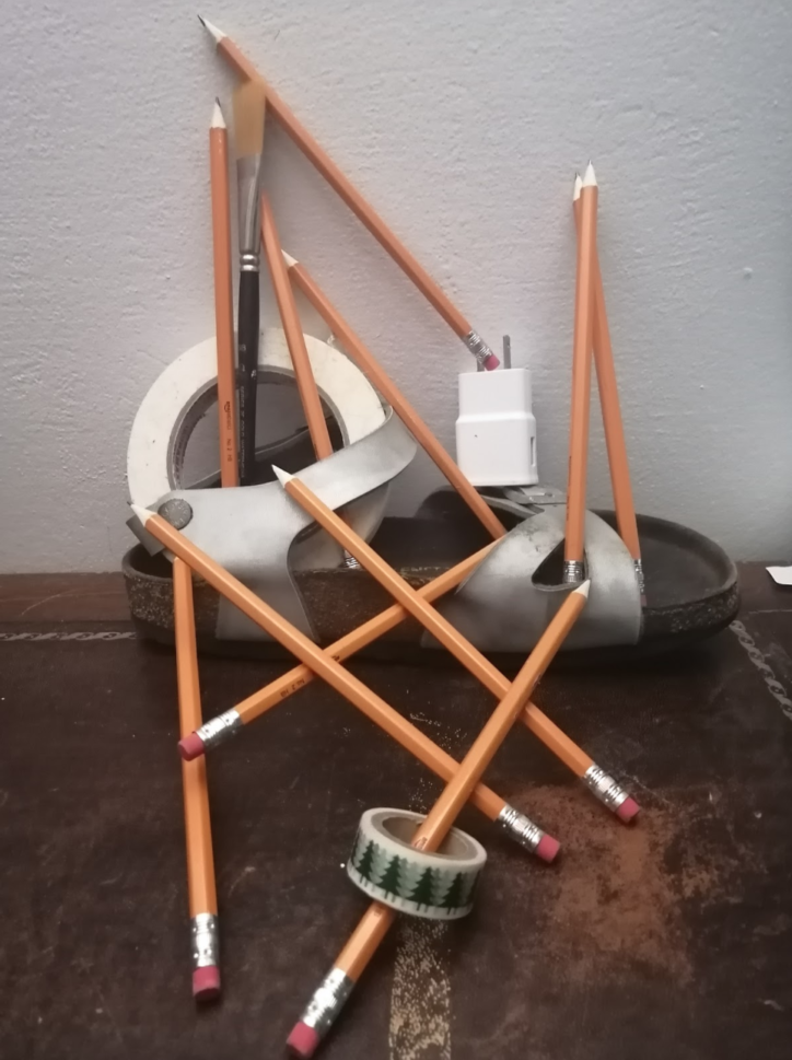
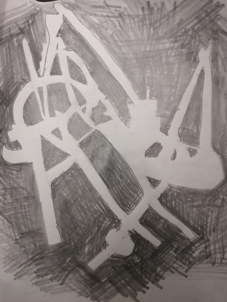
- Find multiple household objects. From them, create a temporary mini sculpture (or arrangement/composition) that has a lot of holes in it. Don’t worry about it looking ‘weird’. Here’s mine, that was created from a sandal, tape, and lots of pencils
- Draw the negative space of your arrangement.
- Remember, do not draw what the arrangement looks like - draw the space it isn’t in!
- Fill in the negative space in a solid colour
- Don’t worry if it doesn’t look like you expected.
Tip: A way to think about negative space is as the space between things
Why texture?
Usually when we think of art, we just think of it as something to look at. But artists try to engage more senses than just sight - using texture is a way to engage touch. Even drawings that are not meant to be touched can appear like they have texture.
What is texture?
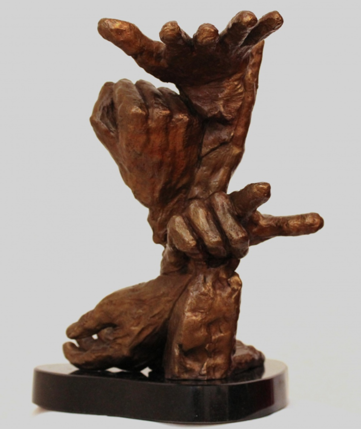
Texture is the look or form of a surface. It can be real or implied. Actual texture is a texture you can feel, like that on a rough bronze sculpture. Implied texture is just a visual that cannot be felt; if you touch a drawing you will only feel the paper but you’ll see texture.
Line and shape as texture
Different types of lines can create different implied textures. Think of the difference of lines in someone’s hair versus the lines on concrete. Shape can also imply texture. Think of a honeycomb.
Pattern and texture
The repetition of shape and/or line is ultimately what creates the appearance of texture. Repeating the same or similar shapes/lines over and over create patterns of variation.
Exercise 1: Hairy Fruit
- Select any fruit or vegetable from your house.
- Draw it - you can either use a contour line method (just draw to draw the shape) or deconstruct into multiple little shapes.
- Decide which direction the hair goes in - horizontal? Vertical? Is it long or short?
- Draw lines to represent the hair over and over again, creating patterns of variation. These lines should follow the shape of the fruit.
Tips:
- Draw the ‘hair’ lines in slightly different lengths to create more variety and realism
- Hair may go off the object slightly if it is long
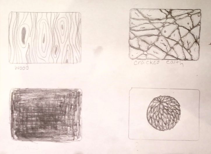
Exercise 2: Texture Squares
When we’re drawing texture, we’re drawing an arrangement of shapes or lines. Sometimes we may try to emulate a real texture, like wood, other times we may be creating our own.
For this exercise, make 4 squares.
Square 1: Wood
- Draw tear drop shapes
- Outline the tear drop shapes
- Draw vertical curved lines that do not intersect the tear drops, but curve around them
Square 2: Cracked earth
- Draw a grid-like pattern
- In each space, draw an irregular shaped ‘rock’
- Hatch along the edges of every rock
- Fill in spaces between rocks, and add additional details
Square 3: Fur
- Decide where the fur begins, and the shape
- Draw overlapping tear drops going in the direction of the fur
- Add in additional lines on the edges of each tear drop
Square 4: You Decide!
Tip: If you’re stuck, see what abstract patterns you can make with only lines or shapes
The Challenge: Textured Shattered Line Art
- On your paper, draw a bunch of overlapping curved and zig-zagged lines.
- In the spaces created, draw a unique texture. You can use some of the ones we practiced above, or try new ones.
Click here to access the video tutorial
Composition is all about balance, and placement in your drawing. Composition is the arrangement of the elements in an art piece. This element is important because it is what makes an art piece aesthetically pleasing, as all the elements of the art piece are in balance with one another. In other words, composition is how you create the drawing as a whole
“Composition is the art of arranging in a decorative manner the diverse elements at the painter’s command to express his feelings” - Henri Matisse
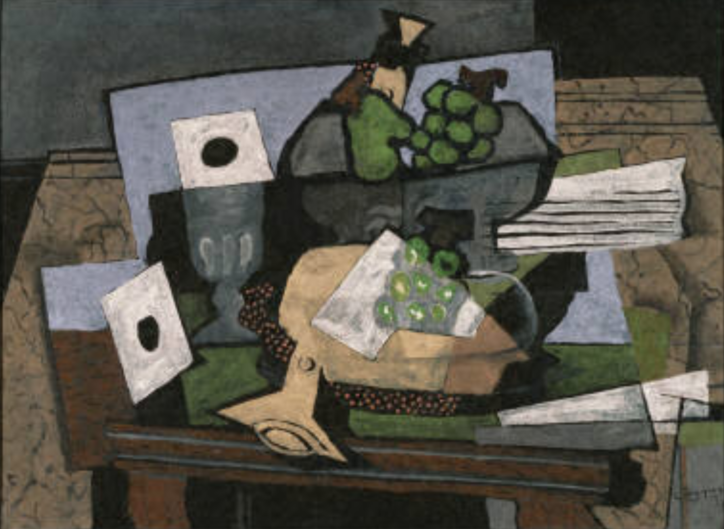
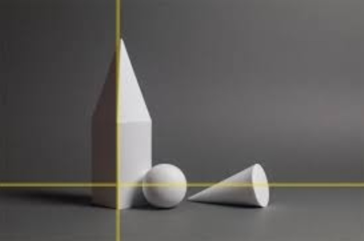
Take this drawing for example.[Not my drawing, however the video includes a drawing similar to this] It’s pleasing to look at, as all of the shapes and shaded in the corrected fashion and in the they are all balanced. Balance, space and rhythm (will be further explained) is used to make this drawing structured, and gives it a nice flow.
8 Principles of Design
Following these 8 Principles of Design will help you when composing a drawing, and are essential to creating a pleasing composition.
Exercise
We will be drawing an 8 squared grid, and in each section we will draw an example of what a principle of design. Get out a piece of paper, draw and large rectangle on it and divide into 8 equal squares. Each square will represent one of the Principles of Design.
- Balance: refers to the placement and weighing of elements in your drawing. Take the picture above for example. The circle, the cylinder and the blocks are placed and shaded in a way that they don’t overlap one another, and they each have their own space. Your eyes are immediately drawn to the centre of the page, but the shapes are not overwhelming. Balance is pretty subjective, it just relates to your sense of easiness in relation to your drawing.
- Contrast: Strong differences in a drawing, whether that be through texture, shapes or concentration of a colour or shade. Looking back at the example drawing, you see a heavy contrast between the dark shading of the cylinder, versus the light side of the cylinder. There is also the contrast between the various shading techniques
- Proportion: Proportion relates to the relationship between the sizes of the objects, and also how they are positioned together in your drawing. The size of objects drawn in your drawing can also relate to the distance the objects are in the drawing (ie: middle, back and foreground). When looking at the picture above again, the sphere is positioned slightly in front of the cylinder, and the cube is placed on top of the other block, creating various proportions in the drawing. This can also be seen when looking at Variety in the piece.
- Pattern: Pattern is just what it sounds like: the repetition of a certain object, or print, or movement. Finding an example of a pattern is quite simple: looking at a line sheet of paper for example. Those lines, those colours and the holes on the side are all different patterns. But patterns don't have to be exact replicas of one another. When looking at our example image, pattern can be seen in the way of the shading. They are all shaded in a similar fashion, creating a unified sense of repetition in the piece.
- Emphasis/ Focus: This principle of design includes the focal point, or emphasis point in your drawing. It is where your eyes are drawn to at first glance. Depending on the drawing, you can be drawn to a dark spot, or the lightest spot, or the one spot or object that stands out. For example, think of a sunset drawing or painting. The smaller sun is usually must lighter when compared to the rest of the art piece, and your eyes are immediately drawn to the sun. That would be the emphasis object, or focus.
- Movement: Movement refers to the placement of objects and textures that creates the illusion of movement in your drawing. This is a little difficult to be found in the photo above, however, movement can be either very present, or not present at all. It is the artist's choice whether or not they want to have a strong sense of movement in their piece. But we can often find movement in another principle of design: Pattern.
- Unity: (Often combined with Harmony) Refers to how everything in your piece of art works together. Composition and unity work hand in hand, and if all the pieces in your drawing work together, then it created a unified, cohesive piece.
- Rhythm: Now rhythm can be a little difficult to explain, as it can be confused with movement. Keep in mind that movement refers to the illusion of movement within the drawing. Rhythm on the other hand refers to the flow, or the tempo and beat the artwork follows. Not looking so much at how it moves, but more so how flows to you.
When you do a drawing, you don’t have to go down the list and make sure you have each of these: it is your drawing and you are allowed to create it however you would like. However, if you are having difficulty composing your piece, and making things look the way you like, go over the 8 principles of design and try to incorporate these elements into your design.
Rule of Thirds
This is commonly used by photographers as a way to frame their piece. This helps the composition in the drawing, and allows for the artist to map out what they are doing on their page. You draw three lines, separating background, middle ground and foreground, horizontally. Then draw an accompanying three line vertically. This way you get to break your drawing into separate parts, and see how the balance and unity of the piece works together.
Challenge
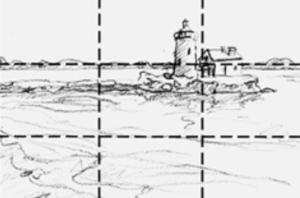
Grab a pencil and a blank piece of paper. Look up a photo (or do from memory) of a building or artifact you enjoy, or means something to you. For example, I would use my cabin from back home, but you can do anything you'd like. Famous buildings, a statue, even something in nature; anything that is usually slightly larger and static (doesn’t move). Draw it wherever you would like on the page, a little bit smaller than you usually would, and remember- it doesn’t have to be perfect. This is just a simple sketch for you to grow comfortable with balance and composition. (Look at the photo above for an example of what kind of size would work the best). Once you have drawn your image, conduct the “rule of thirds” or the 6 lines on your pages around your image.
From there, plan out the rest of your drawing. Once again, this is only an exercise, you don’t have to spend long on it. This is just to begin to understand the purpose of composition. Plan the surroundings of your drawing. In the example above, the lighthouse acts as the focal point, as it is the most detailed and concentrated piece in the drawing, but the surrounding horizon and the land creates unity in the piece, and creates a calming rhythm. You can add in any setting you would like, but do your best to create a balanced and easy piece to look at.
Click Here to Access the Fabric Tutorial Video
Click Here to Access the Still Life Tutorial Video
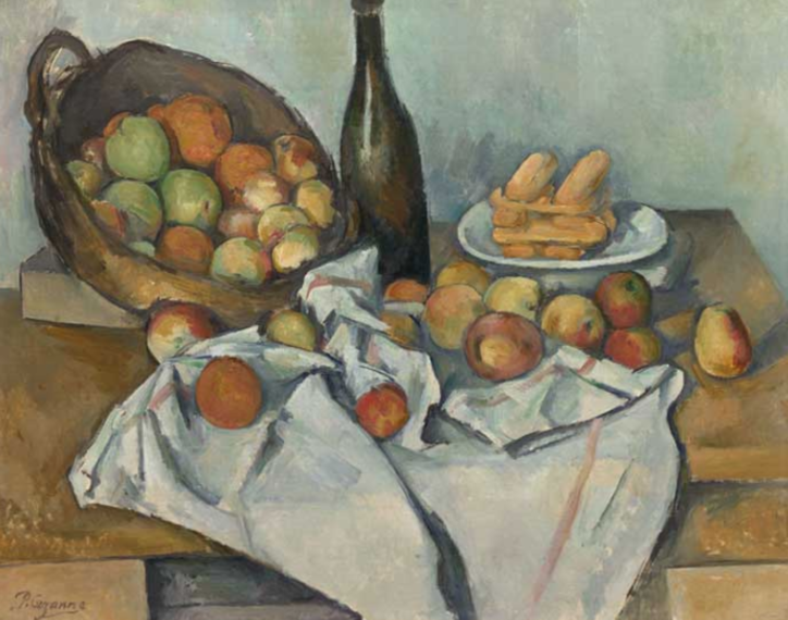
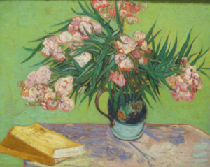
What is a still life?
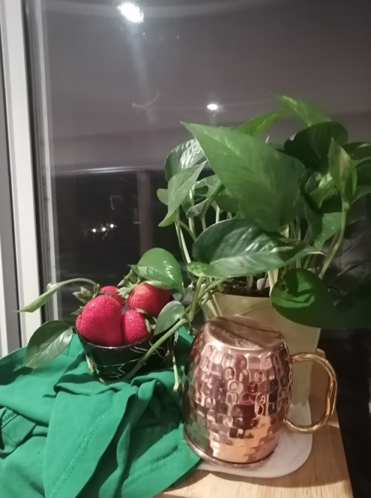
A still-life is painting or drawing of an arrangement of everyday objects. The way we arrange common objects can make them look interesting and different.
What goes into a still life?
Common objects in a still life include natural elements such as fruit and flowers, typically paired with items of different textures such as fabric, glassware, vases, and bowls. However, there are no hard rules to this.
Why does it matter?
Still lives make you better at drawing. When drawing a still life you’re working with all of the elements of art, and practicing object relativity as well as observational drawing.
Composition
Composition refers to the arrangement of the objects used for a still life.
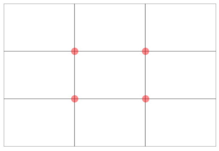
Rule of Thirds
The Rule of Thirds uses a 3-line grid to create an interesting composition.The 3 lines create intersection points (the red dots). These points are ideal for placing the focal point on. This rule works to shift the balance of your composition on to one side, so things are heavier on one side than other. This also uses negative space!
Rule of Odds
An odd number of objects is more interesting to look at than an even number.
Leading lines
Diagonal lines that guide the viewer’s eyes to other parts of the image.
L-Shaped Composition
A composition structure that creates an “L”. The tallest object is placed on a vertical line, and the rest of the objects are placed at its base horizontally.
Composing your own still life
- Decide what you want to be in it. I suggest 3 objects that cover some of the following:
- Something natural, like a fruit, plant, or flower
- Something tall, like a vase, stein, or wine glass
- Something short, like a bowl,
- Something that is fabric, like a cloth, or pillowcase.
- Figure out what you think is the ideal composition based on the composition ideas above. If you’re stuck I suggest using the ‘L-Shaped Composition”. Something that may be helpful is to use the grid mode on your phone’s camera. Consider:
- What is the tallest point?
- What are my eyes drawn to?
- Find a lamp and shine it on your still life to create value. Consider:
- What textures do I see?
- Where is there a shadow?
- Where are there highlights?
Drawing your own still life
Continuously look at your still life. This is an observational drawing!
- Study your still life
- What does the silhouette look like? Think of this as basic shapes.
- Draw the basic shapes. Consider the space that is being occupied versus the negative space
- Once you have a general sketch laid out, think of the details. Begin defining the actual shape.
- If you’re feeling overwhelmed or uncertain, take a step back. Breathe and describe what the problem is - not ‘this sucks” but “this plant should be taller”, or “this vase is more curved”
Shading your own still life
This is concerned with the value. Go back to our value video and write up if you need a reminder on what that is!
Value Write Up and Video:
- Look at where the still life is darkest - likely in the shadows that are being cast by the objects.
- Consider colour: colours have an intrinsic value. When we use pencil, blue will show up as a darker value than yellow.
- Lightly draw contour lines detailing the change in value; in other words, section off areas of the drawing that have similar values.
- Start from the darkest spaces, and work toward the lightest
This process can be overwhelming at first - just keep trying! Drawing is a skill. Anyone can draw. All you need is an open mind and a willingness to have a go. It might be rough, but it’s also worth it.