University Affairs, May 2008 - “Upper-year Exam Malady”

What were students thinking?!?

Just out of plain ole’ curiosity I one day decided to see if academic performance by SC/BIOL 1010 students in FW 06-07 differed for students who took advantage of every bonus mark offered for filling out survey questions, compared to students who didn’t fill out a single survey (and hence received no bonus marks). The results were not totally surprising. Students who completed every survey and received every bonus mark did significantly better on the final exam compared to students who didn’t fill out a single survey (average multiple choice score 64% versus 52%; t = 9.4, n1 = 338, n2 = 167, p < 9.0*10-19). I am assuming that the students who filled out every single survey were the ones who came to every class, arrived on time and listened and paid attention when I announced the surveys at the start of class, or regularly used the course WebCT site where survey announcements were also posted. I am assuming that these students invested more in the course throughout its duration as opposed to cramming it all in for the last few days before the exam. What is the moral of story? Continually keep on top of things and you’ll do substantially better in the course.
Personal consumption habits and fiddling with time series
Out of curiosity, I wondered how my family’s rate of natural gas consumption (we have a natural gas furnace) varied with climate e.g. cold winters versus warm summers, particularly during abnormally warm or cold winter months. So, first off I plotted the average daily consumption of natural gas (provided each month on my gas bill, easy to access as I’ve retained about every monthly bill I’ve ever received since about 1996, tucked away in labeled file folders arranged alphabetically in a filing cabinet in my home office) against mean monthly air temperature (obtained from the Canadian Meteorological Service’s website for the closest monitoring station to where I live). The following plot (Figure 1) is produced:
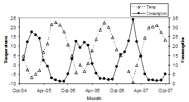
This plot seems simple enough, when temperature goes up, natural gas consumption goes down. This makes sense, as when it is warm out why would the furnace being chugging away like a locomotive to heat the house?
However, I was dissatisfied with this plot, I wanted something that really showed the strong relationship between monthly temperature and consumption. So, I flipped the y-axis for the consumption data, producing the next plot (Figure 2).
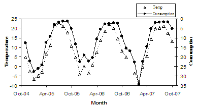
Ah, much better. Okay, now this graph really shows the relationship between the two. It even shows the little ‘blip’ in both time series for January 2006, which was an anomalously warm month. This plot seems to show that natural gas consumption is always cycling at a higher value compared to the monthly temperature…but wait a minute, that can’t be right. That perception seems to be coming from the fact that I’m graphing two different variables with different units. This perception is flawed, as it comes from the different scaling for each separate variable being produced on the same graph.
So, my next task was to standardize each time series so that they’d be in units and scaled to equal ranges, so that an X increase in one variable of very similar magnitude to a Y increase in another variable would show up as similarly-sized shifts in time series values. A good transformation to standardize data is to convert raw data to Z-scores, achieved using the following equation: Zi = (ni – Averagen-i)/Stdevn-i, where Zi is the resultant z-score for data point i, ni is the raw value of data point i, Averagen-i is the average for the whole dataset (with i data points), and Stdevn-i is the standard deviation of the whole dataset. The way to interpret z-scores is as follows: if a data point has a z-score of +0.6, it has a value of 0.6 standard deviation units greater than the average of the whole dataset. If a data point has a z-score of -1.2, it has a value of 1.2 standard deviation units less than the average of the whole dataset. Confused? Let’s look at this again using raw numbers. If a dataset has an average of 20 units, and a standard deviation of 6 units, then a data point with a value of 15 units would have a below-average value, and as it is within 5 units of the average, it is within one standard deviation (6 units) of the average. This data point of 15 units expressed as a z-score would be = (15-20)/6 = -0.83. Follow me? Okay, so, by standardizing the data points in Figure 2 to z-scores, I get the following plot (Figure 3).
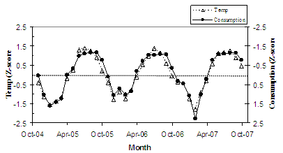
Now we’re getting somewhere! This plot really shows how the magnitude in change in mean monthly temperature produces a change of similar relative magnitude in natural gas consumption. The coldest month in the whole series, February 2007, is also the month with the highest rate of natural gas consumption for the month, where for both data sets the value for this month is almost 2.5 standard deviation units away from the average for the whole time series.
Okay, now what I was really curious about was whether or not there was a substantial difference in gas consumption rates during periods when my wife was home on maternity leave (within this time series, from Nov 2004 to Feb 2005, and Jul 2006 to Jul 2007). Normally, when we go to work we turn down the heat (during the winter) or shut off the air conditioning (during the summer). When my wife was on leave she was typically home all day, with the occasional venture outside (e.g. to the park, or shopping) to maintain her sanity; this would mean the furnace was on the whole day, either heating the house in the winter or cooling it in the summer. So, in this case, I was interested in the differences in z-scores for each time series – if a winter month was unusually warm, yet gas consumption was not correspondingly low, then in Figure 3 you should see the white triangle ‘above’ a black dot. With this in mind, if you squint your eyes a bit, the winters of 2004-05 and 2006-07 (winters when my wife was home during the day) appear to have differences between the two data sets that suggest higher gas consumption relative to the temperature, compared to the winter of 2005-06. As I was a bit constrained in terms of months for 2004-05, I compared the z-scores for temperature vs gas consumption for the Nov – Feb period of each winter (2004-05, 2005-06, 2006-07). As I had 3 ‘treatments’ (first-maternity-leave, no-maternity-leave, second-maternity-leave), I ran a one-way ANOVA. This statistical test was not statistically significant (F = 1.9, df =2,8, p = 0.2), indicating that the differences in z-scores when comparing the two time series followed a similar pattern in the 2 maternity-leave winters compared to the no-maternity-leave winter. I thought that maybe the low number of data points (n = 4) in each treatment was resulting in low statistical power (e.g. even if the test was significant, I had a low chance of properly determining that). So, I pursued a different way of comparing datasets, this time I compared the whole period my wife was on her 2nd maternity leave (Jul 2006-Jun 2007) with the whole previous year (Jul 2005 – Jun 2006) when my wife was not on leave. Was there a statistically significant difference in z-scores when comparing the two data sets in the ‘Leave’ year versus the ‘No Leave’ year? Yes, there was (paired t-test, t = 2.1, df = 11, p = 0.03).

The pattern of difference was such that my suspicions were confirmed – there was relatively higher gas consumption during the maternity-leave-year compared to the no-leave-year (Figure 4). This is manifested by a greater positive difference when subtracting the gas z-score from the temperature z-score (note: the sign of the gas z-score was inverted (+ to -, and vice versa) to make a comparison analogous to that in Figure 3, so that a warm month had a positive z-score and a month of low gas consumption also had a positive z-score. So, if a month was unusually warm (high z-score) and gas consumption was correspondingly unusually low (high z-score; the sign was inverted, remember?), then subtracting one z-score from the other should produce a value close to zero. If a month was unusually warm (high z-score) yet gas consumption was not correspondingly low, then subtracting the gas z-score from the temperature z-score would produce a positive value.
So, in Figure 4, negative values mean that gas consumption is low relative to the temperature conditions (relatively low consumption in cold winter months and hot summer months) = savings in $$$. The moral of the story? If the pre-baby pattern was that both partners worked and the house sat empty (and un-heated or un-air-conditioned) during the day, you have an increase in household costs simply due to increased heating or air-conditioning the house, because the house is now occupied 24 hours a day (for the first few months, anyways). No pregnancy book ever mentioned that in their Finances section…
Disclaimer:
Materials presented in the personal section of Roberto Quinlan’s webpage solely reflect his personal opinions and do not convey the viewpoints or opinions of York University or any other person or entity…