To reinforce the strength of the York brand, our design system creates a sense of continuity throughout all University-related content. Using the graphic elements of this system – our visual language – links your Faculty, program or department to this strong, identifiable brand in the minds of your internal and external stakeholders. Here’s how these unique elements can help you.
Window of Positive Change
Created specifically for our use, the “Window of Positive Change” is an apt reference for York University, as we are a leading proponent of positive change through our research, scholarship, progressive teaching practices, advocacy and student engagement.
While simple and flexible, this design element is a metaphor for a progressive academic experience, openness to ideas, transparency, inquiry and critical thinking. The idea offers possibility and hope – as a witness to social, technological, political and cultural change. It places the York community in both the interior and exterior worlds at the same time, allowing the viewer to gain empathy and a broader perspective.
The window can be used with the colour palette and other elements to create meaning.
The Window of Positive Change is the proprietary design element of York’s visual design system and an apt reference for York University – a leading proponent of positive change. The Window of Positive Change is a vessel within which the York community (from the formal institution to its partners and students) has the opportunity to create meaning. At times, it places the subject inside the frame but always with a view outward.
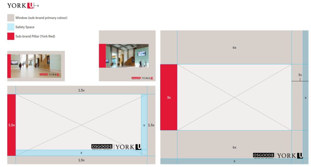
Pillars within the Window: Another feature of the brand system is a “pillar” that identifies sub-brands and Faculties within the larger master brand. Its various colours represent the specific sub-brands and Faculties, and there are many ways it can be applied to create meaning.

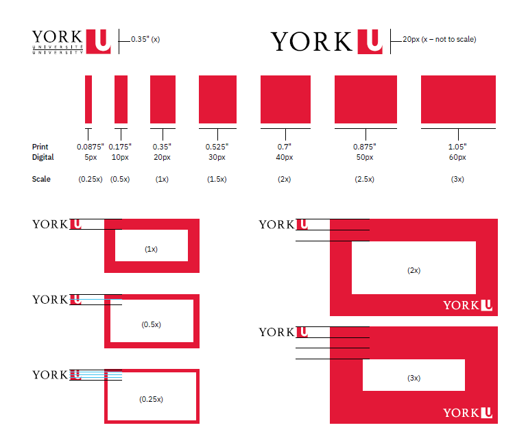
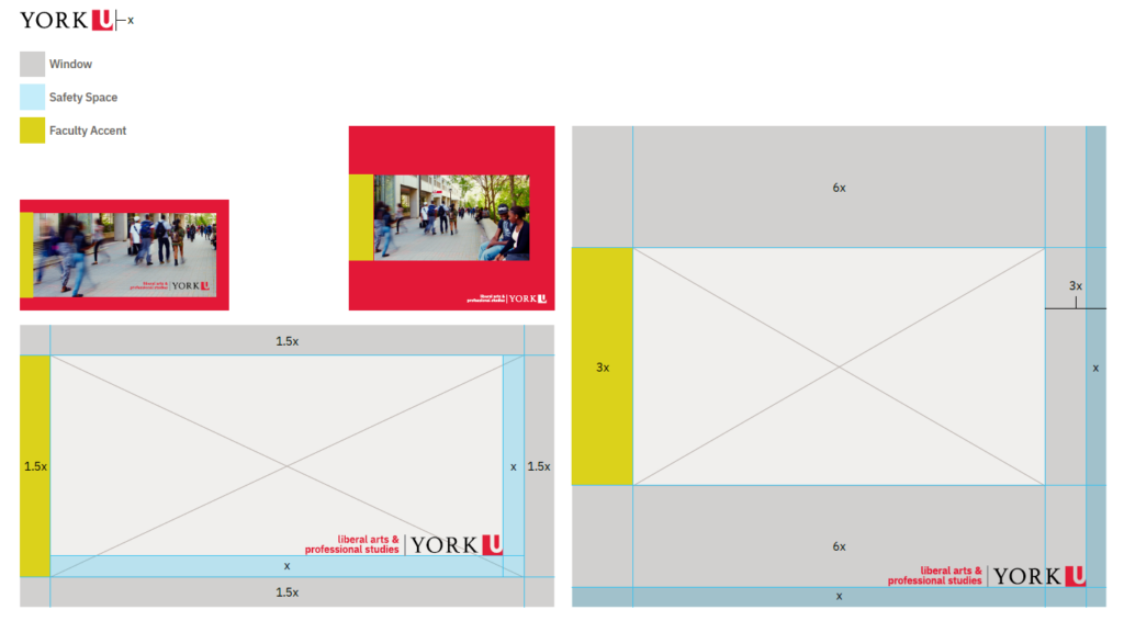
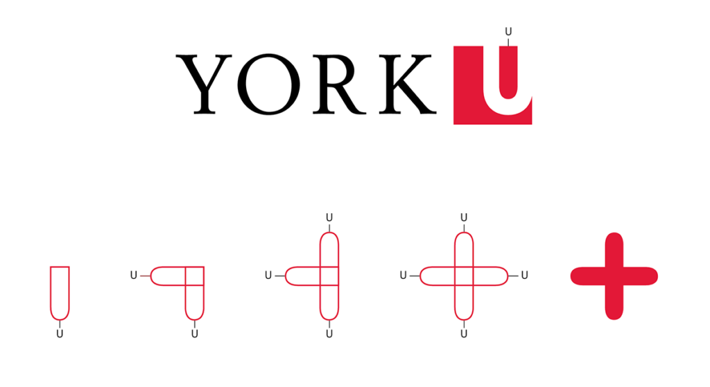
The width of the Window of Positive Change is determined by the size of the York U square. A simple incremental rule consisting of basic multiplication is applied to produce the various window widths in use. The rule states that starting from the base size (referred to as x), the window may grow or decrease in size by multiples of 0.5. This means the base size (x) can be multiplied by 0.5, 1, 1.5, 2, 2.5, 3, 3.5 and so on.
The only exception to this 0.5 rule is that the base size (x) can also be reduced one step further by multiplying it by 0.25. This allows for the creation of a “keyline” window. Using this formula, a vast variety of widths can be created. There are no formal rules for how to size the logo, but users must adhere to the minimum size for proper reproduction.
The logo should be clear and prominent. Adhering to the incremental rule will ensure consistency throughout all digital and print materials. When the York logo does NOT appear with the window (e.g. in social media posts), the minimum sizing used for the logo (0.35” for formal/print and 20px for digital) should still be applied to sizing the window. This would give a base starting width of 0.35” for formal/print and 20px for digital, which the incremental rule is then applied to. For windows that require bleed, the recommended width is 1x to allow for proper trimming.
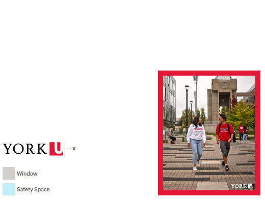
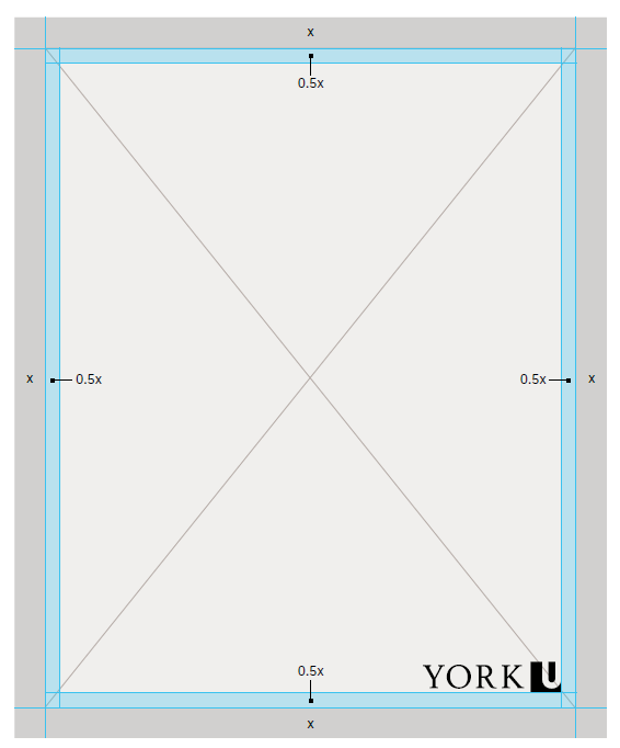
These are illustrations of the blueprint for the Window of Positive Change. The example to the right illustrates both the dimension of the window and the safety space for the York logo. The dimensions noted comply with the incremental rule. The grey represents a sample window dimension, while the blue indicates the safety space to ensure the York logo is clear and has maximum impact.
The York logo may be placed inside the window, outside a floating window or on top of a thick window. The safety space ensures the logo stands out from other content, while still always being placed fairly tight to the window.
The light X represents image placement.
For full rules and examples please see Section 5 of the Brand Standards.
The pillar may also be used by sub-brands when communication is pan-university. The window would be coloured according to the main sub-brand colour, with a York Red pillar. For example, Osgoode Hall Law School would use a pewter window with a red pillar. You may also reverse the sub-brand colour placement, with the pillar as the sub-brand colour and the window being York Red. The sub-brands (and Faculties) must use the pillar on external-facing communications, but have the flexibility to use a solid Faculty-coloured window for casual or internal communications. However, York Red must still be used in the proper proportion.
The light X represents image placement.
Here are some examples of the window system for sub-brand use, including the pillar, and open and floating window. Under certain conditions, multiple coloured windows (using the sub-brand and primary palette) may be used to indicate breadth of the University in one communication. Check with your communications lead to ensure compliance.
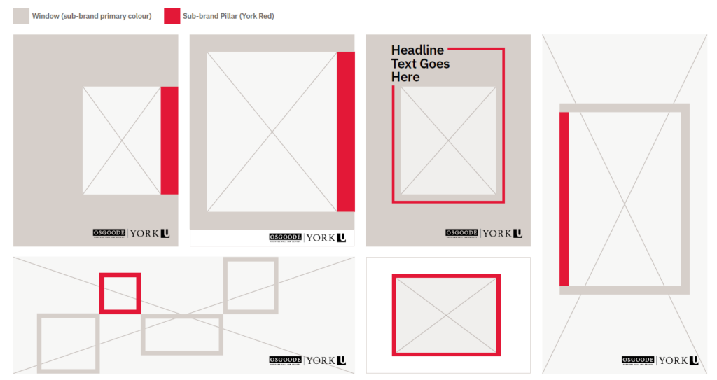
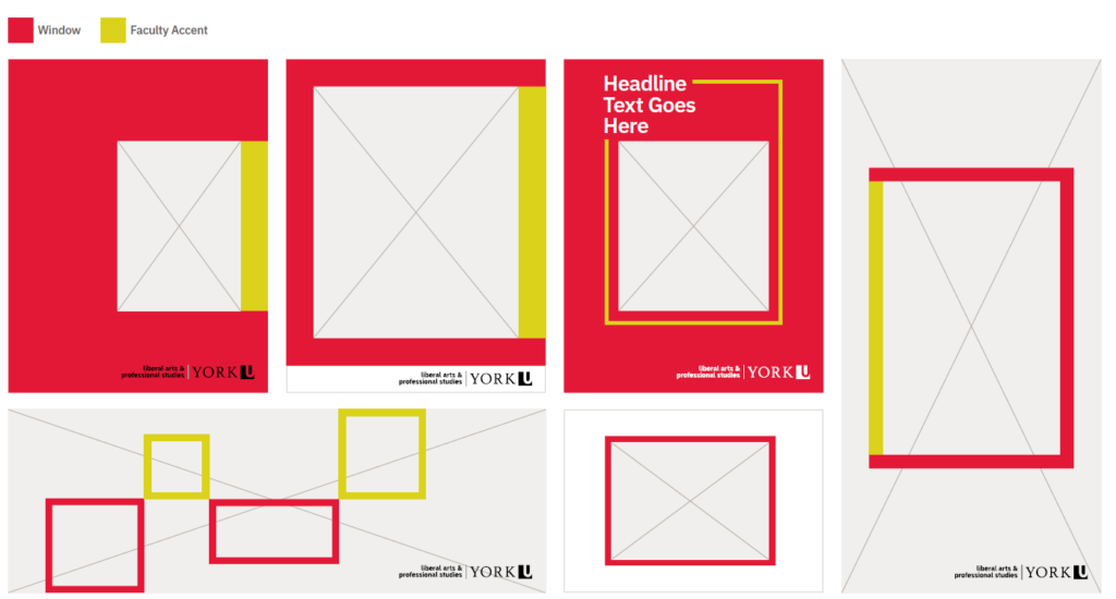
A “pillar” may be used to identify sub-brands and Faculties within the larger master brand. The inset pillar is integrated within the overall window structure and should be the same width. The pillar may be used on the left or right side of the window while still observing the safety space rules for the logo. For Faculty use, the window should be York Red or white with the pillar in your Faculty accent colours.
The light X represents image placement.
Here are some examples of the window system for Faculty use, including the inset pillar, and open and floating window. For external communications, the window must be York Red or white with a pillar in the Faculty colour.
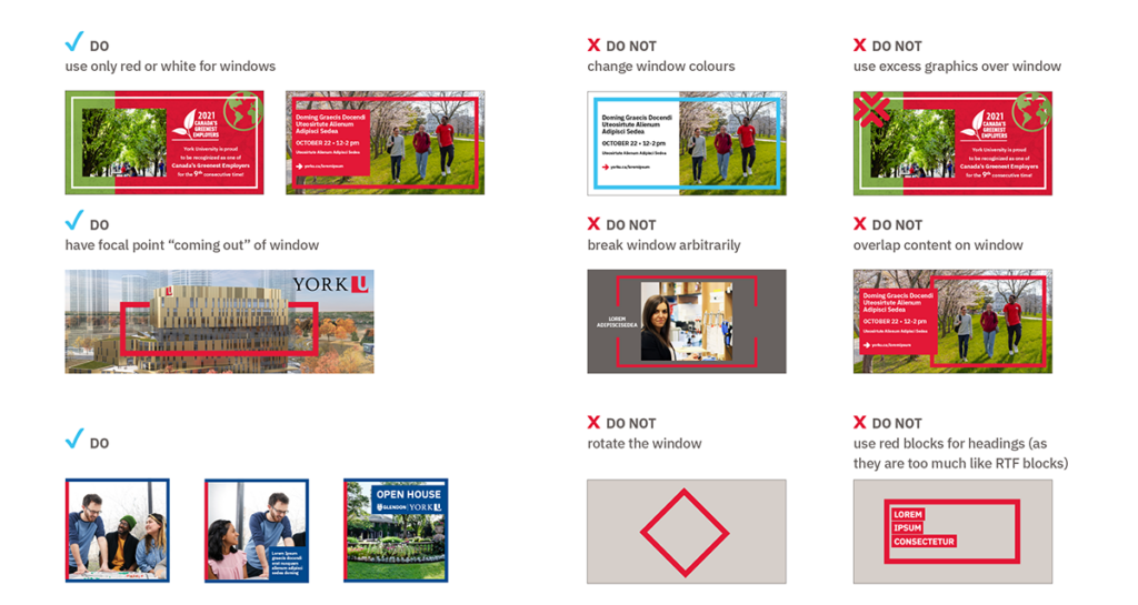
Please see below for examples of correct and incorrect usage of the Window of Positive Change.
Emblems
A suite of unique emblems has been developed for use by the York community. They are based on a common geometrical lozenge shape, derived from the interior of the York U square. The emblems are flexible enough for print and digital applications, and provide another element for expression – from embellishing design to wayfinding and action items. Because the emblems are based on geometry, there are opportunities to create new versions to suit your message, but please contact University Brand & Marketing cpabrandmar@yorku.ca for these requests.
These emblems are accents and are not to be used beside a word mark or to create a logo. This helps protect York’s brand integrity.
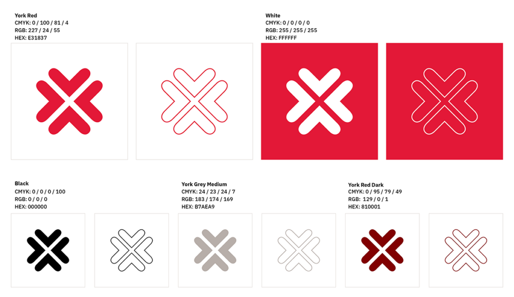
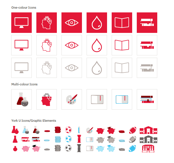
There are ten different colour versions of the emblems: solid York Red, solid white, outlined York Red, outlined white, solid black, outlined black, solid York Grey Medium, outlined York Grey Medium, solid York Dark Red, solid York Blue, York Blue outline and outlined York Dark Red. This range can be applied in both print and digital communications, on photos and solid backgrounds.

Use these emblems to provide another element for expression. The emblems have specific gestures such as wayfinding and meanings to be used to visually support York’s key messaging, tone and voice. They should only appear in approved York U brand colours.
For the full suite of emblems please download here
Icons and Graphics
Icons and graphics can be used to support creative development. Please refer to the section below for approved icons and graphics that can be utilized to support your creative needs.
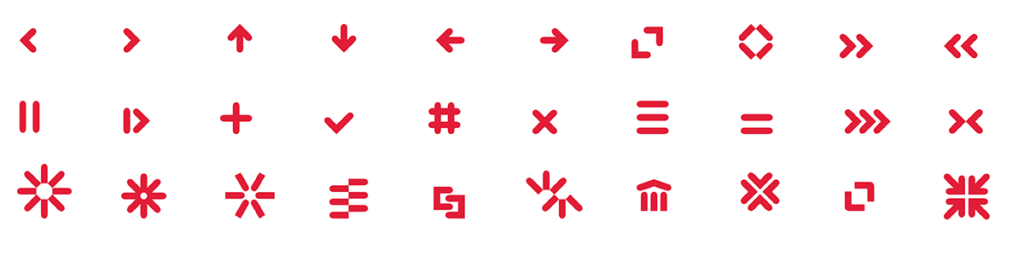
The York icons and graphic elements illustrate a variety of content or messages and are designed to rapidly convey intention in a variety of mediums, including social media, websites and print publications.
Custom icons and graphics may be created if they follow the brand guidelines. If an icon has been purchased, please ensure it is editable to change the colours using our palette and ensure it meets proportionality requirements (i.e. York Red must be prominent, followed by the secondary colours).
Consistency in visual representation is important in enhancing the reputation of York University. Please ensure the brand is being reinforced and visual standards are followed:
- Ensure York Red is prominent
- Ensure use of York approved fonts
- Download Graphic Elements
- Download Icons
Emblem An object or picture used to suggest a concept or an idea. A suite of unique emblems has been developed for use by the York community.
Icon A series of pictorial images relating to or illustrating a variety of content or messages. They are designed to rapidly convey intention in a variety of mediums including social media, websites, print publications and more.
EPS (Encapsulated Postscript) Used for graphics in print projects.
PNG (Portable Network Graphics)
- Used for graphics in web and screen projects
- Can have a transparent background
- Loses image quality if resized to a larger size
SVG (Scalable Vector Graphic)
- Used for logos and graphics
- Can have a transparent background
- Can be resized without losing image quality