Typography or fonts are a powerful part of the brand toolkit. It can be used to impart messages with strength or subtlety in every type of communication. Type can also be used effectively as a key part of design, without the need for imagery.
Jump to:
York Fonts
This page will tell you all you need to know about the York fonts and how to best utilize them.
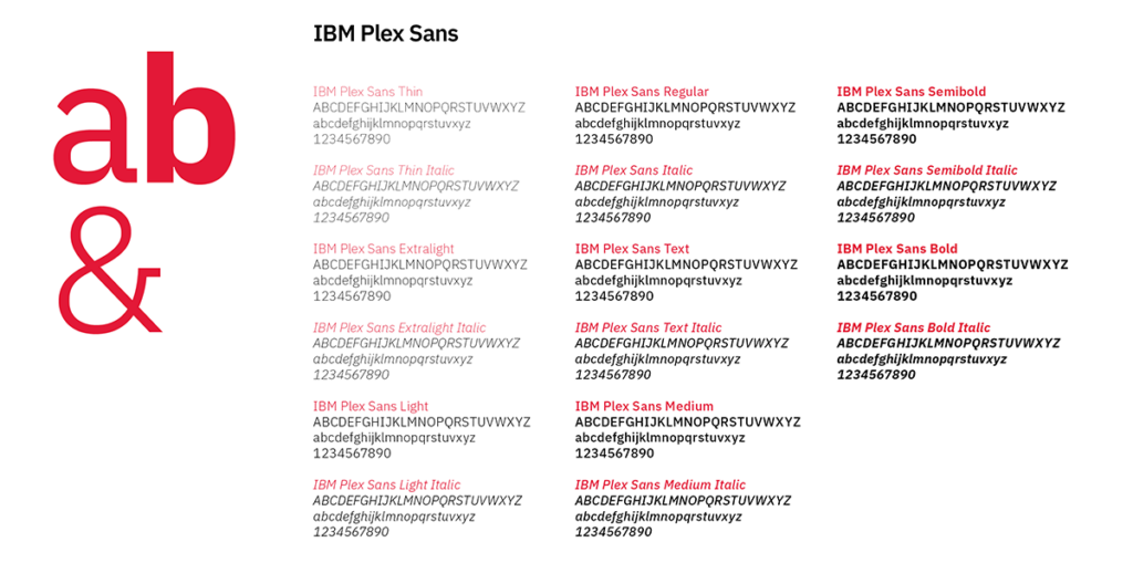
The typeface IBM Plex has been specially chosen as the universal face for York University and is available in four cuts, with the sans serif as the primary choice for York’s brand standards. Its modern character pairs well with our message of positive change while its breadth and versatility appeals to a large university with multiple needs and users. It is a free font and can be downloaded directly from the IBM site (https://www.ibm.com/plex/) or Google Fonts (https://fonts.google.com/specimen/ IBM+Plex+Sans).
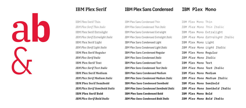
The serif, condensed and mono cuts of IBM Plex all work harmoniously and can be used interchangeably to create interesting design expressions and different tones.
The secondary fonts are to be used in addition to versus in place of the primary IBM Plex Sans.
Plex is distinct, timeless and addresses today’s digital media needs. It also works equally well in print and in small sizes.
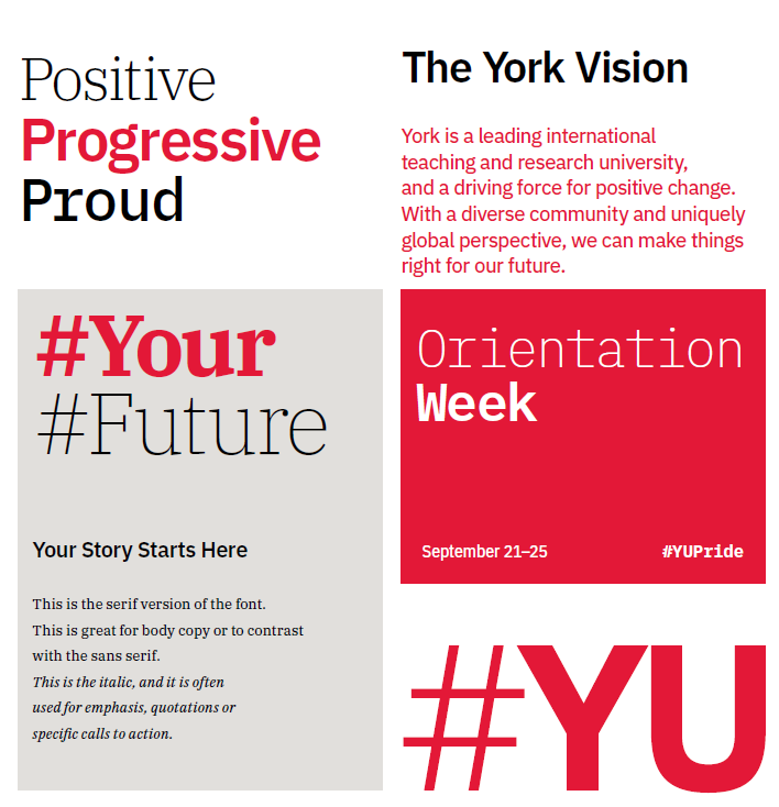
York University’s typeface, IBM Plex, may be used in combination to create texture and interest in your design and communications.
The variety of weights available for each of the four families within the typeface provides ample opportunity for expression – from formal to casual. Use the sans serif as the primary choice, but to create hierarchical levels of information, the condensed, italic and mono faces may be used for differentiation or accent. For example, the serif text face is excellent for conveying longer passages and for contrasting the sans serif.
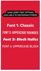
When creating content for Instagram Stories, use the sans-serif fonts. There are currently nine font options available within the application, but the following four are preferred for legibility and brand consistency.
Sans serif font options available in Instagram Stories.
Font 1: Classic, Font 2: Uppercase rounded, Font 3: Block italics, Font 4: Uppercase Block
Font
A specifically designed collection of letters, numbers, punctuation, and other symbols used to set text (i.e. York’s font is IBM Plex).
Kerning
Increasing or decreasing the space between two consecutive characters in a word by very fine increments.
Leading (or Linespacing)
Amount of vertical space between lines of text in a paragraph.
RAG
The shape created by the ends of each line of text. Recommended line lengths are short- long-short-long, with no hyphens.
Tracking (or Letterspacing)
The uniform amount of spacing between all characters in a complete sentence, paragraph or page widow. When the last line of a paragraph only contains one word, that word is considered a ‘widow’ these are undesirable and should be avoided.
Typographic Terms Baseline
An invisible line upon which letters or lines of type sit/rest.