Page Blueprint
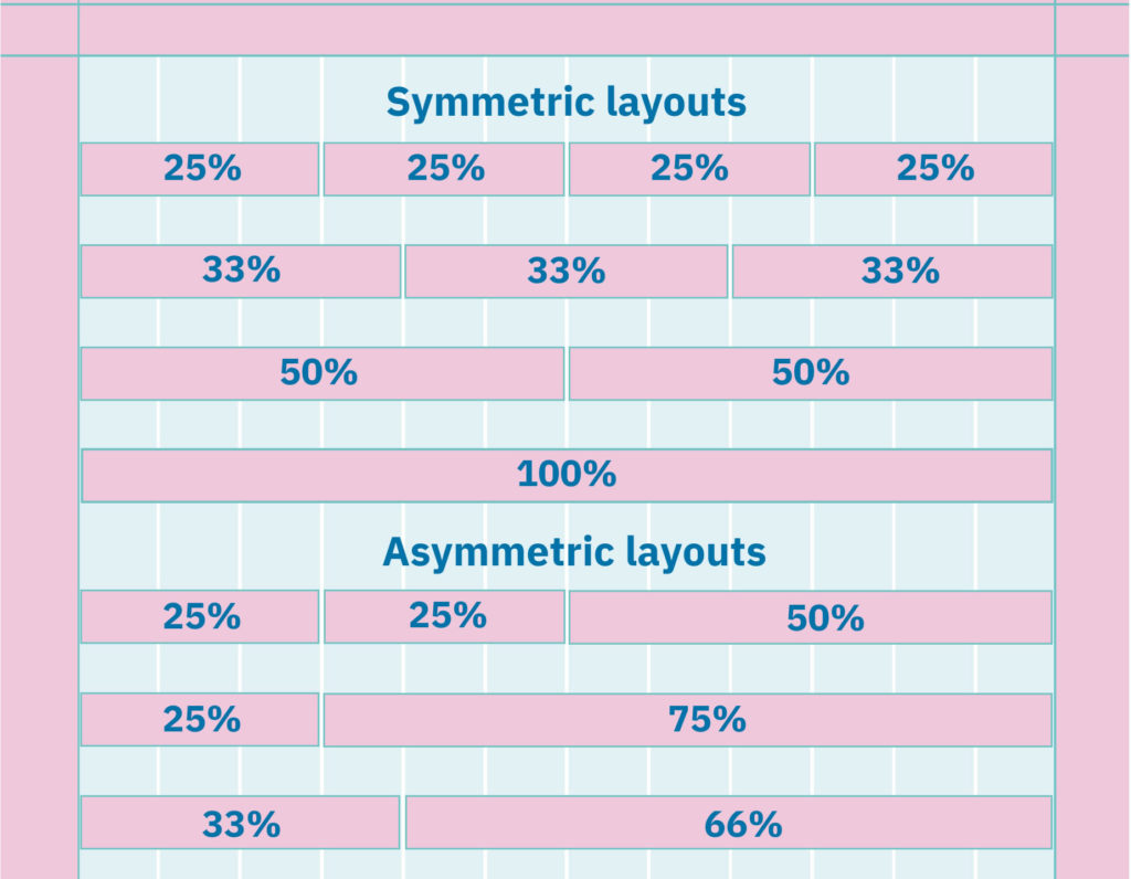
The new web system is based on a 12-column grid. The width of the columns is a percentage value based on the width of the page.
This helps maintain the quality of the blocks in all possible devices. You will notice as you build the pages that some blocks are available in some widths and others are not.
Layouts enable you to control how the content flows and breaks across the page – they can be symmetric or asymmetric.

Designing new modules
York University has created a library of modules to assist in designing your website, keep brand consistency and user experience. However if there is a module outside of this library that agencies, faculties, or units wish to create, it must be approved by Communications & Public Affairs first. To complete this process you must:
- Explain the rationale for the new module and why it is required, instead of using the available modules (include visual examples)
- Provide research and data to back up your recommendation
- Detail how you would incorporate the brand design into the module
- Send this recommendation to cpadigit@yorku.ca for review
- If the module rationale is approved, the final module design must be sent to cpadigit@yorku.ca for review
- If final design is approved, the new module will be property of York University and any future use of the new module will be available to all website administrators

Modules Library
Modules are designed into blocks with a specific function that allows you to publish content on the page. Blocks create a combination of pieces that are dependent on the content type and the audience. This library is meant to be a guide on how to use the blocks based on the brand principles, best web practices and accessibility.
Note: Kindly avoid using secondary colours with hyperlinks as they are not AODA compliant but stick to the default blocks and background colours as these have been tested and confirmed AODA complaint.
To add "Share Buttons" to your posts, kindly send a request email to cpadigit@yorku.ca to get this done for you.
